Why Color Matters in Farmhouse Kitchens
Your kitchen’s color palette isn’t just paint. It’s the emotional backdrop of your home’s heart.
What Makes a Perfect Farmhouse Color?
- Soft, breathable tones
- Connection to natural elements
- Ability to feel both modern and vintage
- Warmth that welcomes family and friends

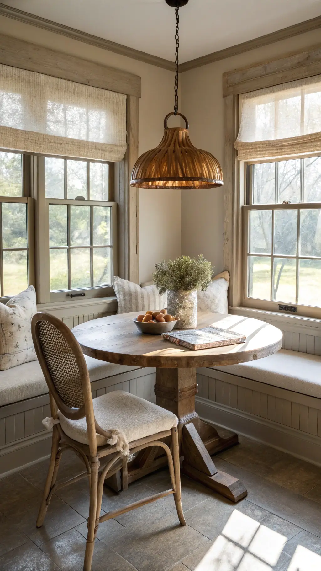
🎨 Steal This Look
- Paint Color: Sherwin-Williams Alabaster SW 7008
- Furniture: distressed white oak farmhouse table with turned legs
- Lighting: oversized seeded glass pendant with oil-rubbed bronze hardware
- Materials: reclaimed barn wood, honed Carrara marble, matte black iron, unglazed terracotta
This is the room where morning coffee becomes ritual and Sunday dinners stretch for hours—your color choice should feel like a deep exhale the moment you walk in.
The Ultimate Farmhouse Color Palette
Whites: The Foundation of Farmhouse Charm
Top White Recommendations:
- Benjamin Moore Simply White
- Sherwin-Williams Alabaster
- PPG Delicate White
Pro Tip: Avoid stark, hospital-like whites. Choose creamy, soft whites that feel like warm sunshine.
Greige and Gray: Sophisticated Neutrals
Must-Try Shades:
- PPG Tornado
- Sherwin-Williams Prairie Grass
- Behr Wheat Bread
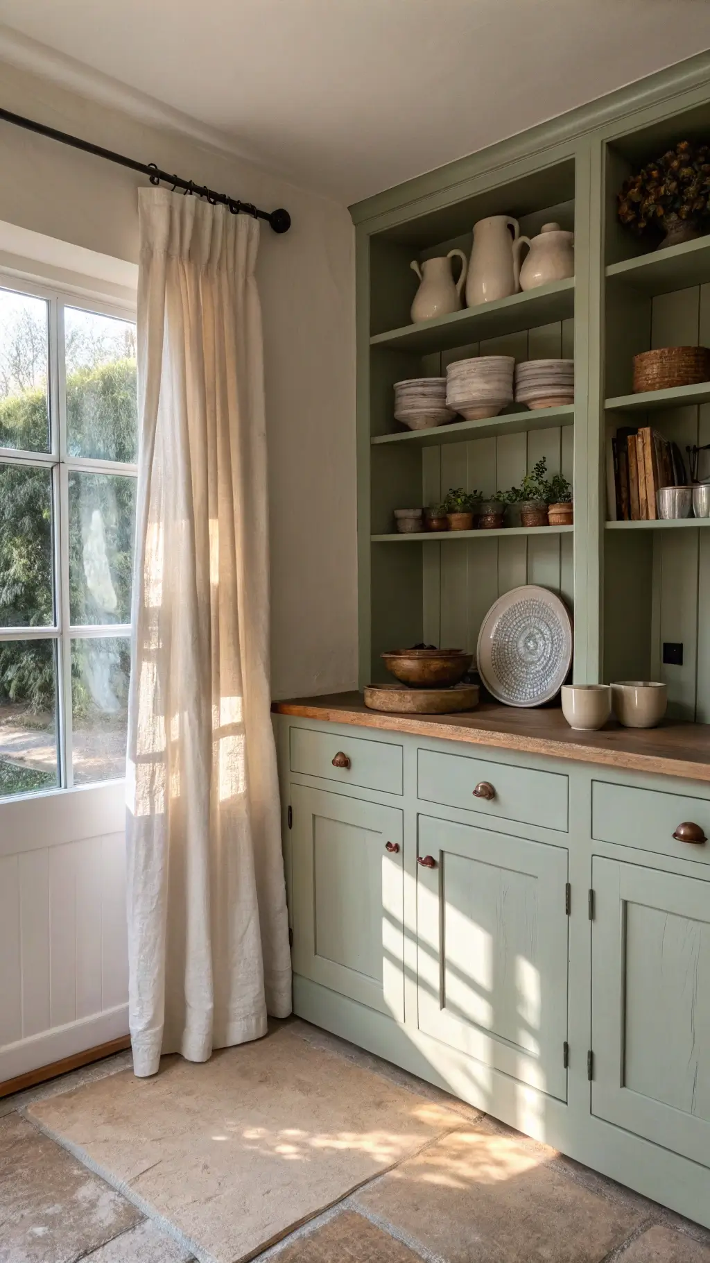
Earthy Greens: Nature’s Embrace
Sage and Green Favorites:
- Benjamin Moore Dry Sage
- Sherwin-Williams Clary Sage
- Farrow & Ball Mizzle
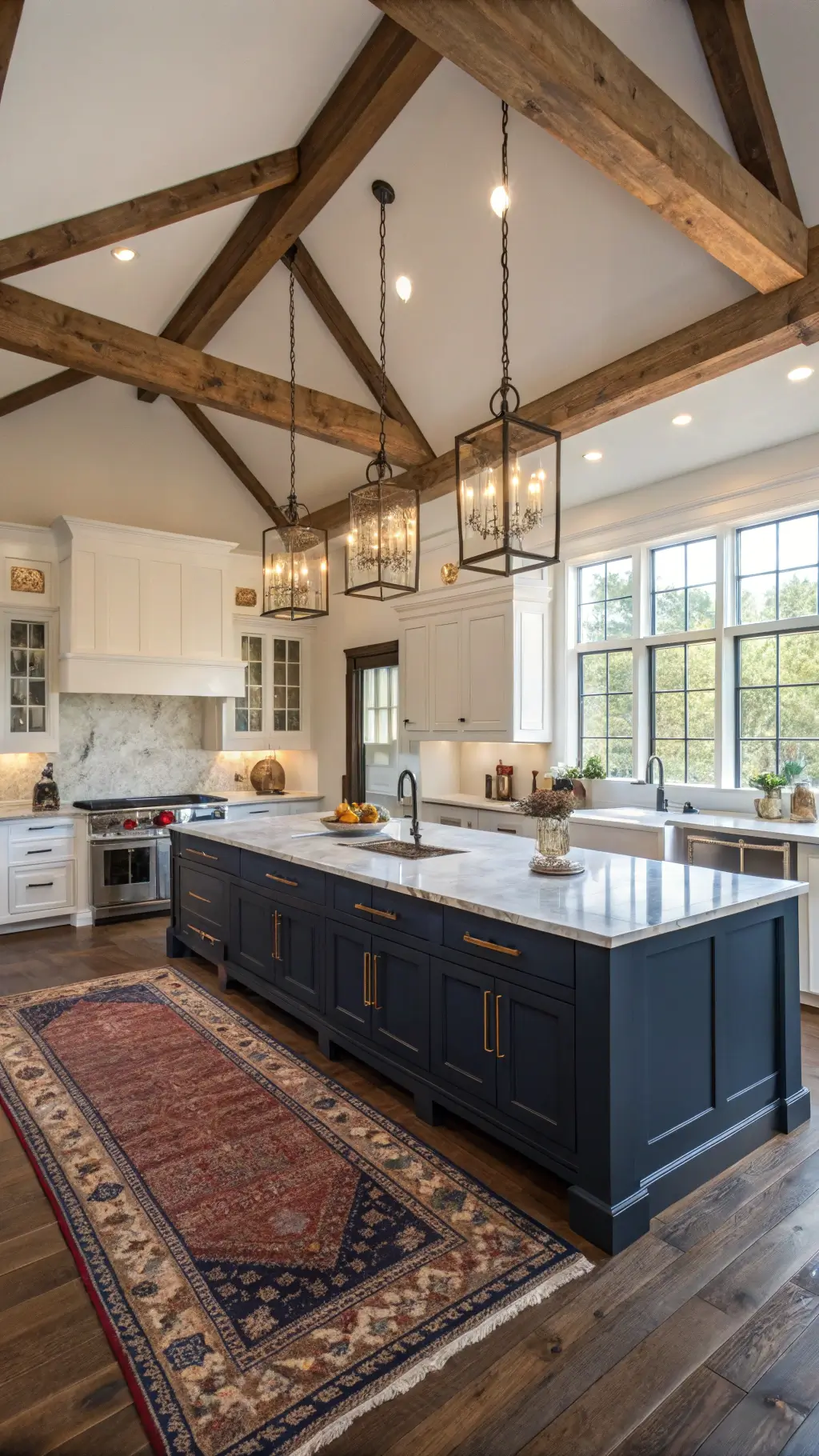
Blues: Calm and Collected
Blue Palette Essentials:
- Westcott Navy
- Needlepoint Navy
- Benjamin Moore Hale Navy
🏠 Steal This Look
- Paint Color: Benjamin Moore Simply White OC-117
- Furniture: vintage-inspired farmhouse dining table with turned legs in distressed white finish
- Lighting: oversized black iron pendant with seeded glass shades
- Materials: reclaimed barn wood, matte black metal, unlacquered brass, natural linen
This is the heart of your home where flour gets spilled and coffee gets lingered over—your color choices should feel like they’ve been there for generations, not like you’re trying too hard to impress.
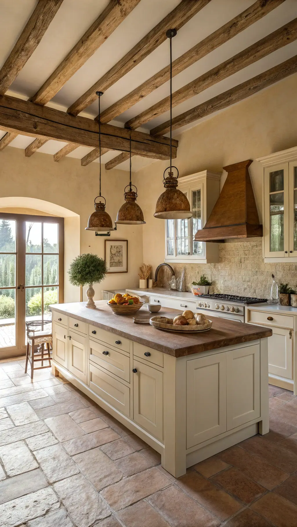
Practical Painting Strategies
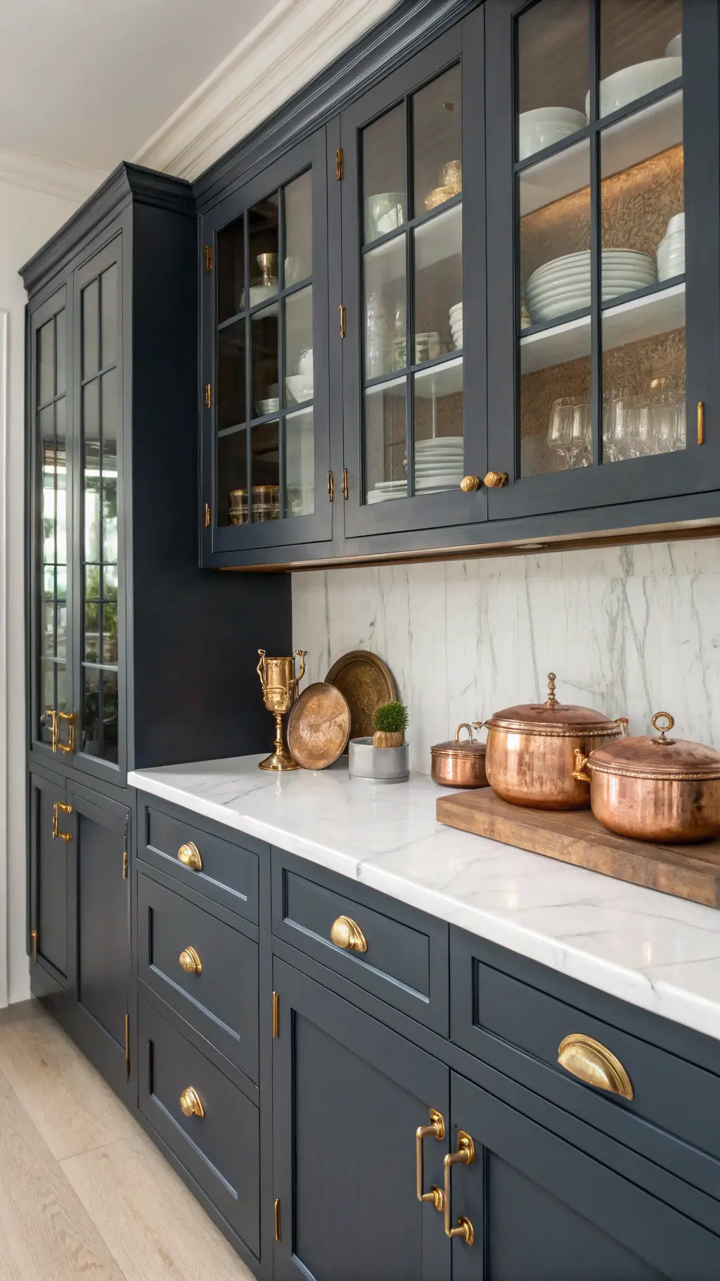
Cabinet Color Tactics
- Upper cabinets: Soft white
- Lower cabinets: Muted sage or gray
- Island: Bold accent color (navy or rustic red)
Wall Color Wisdom
- Keep walls light and airy
- Use neutral tones that complement natural materials
- Consider how light changes color throughout the day

🎨 Steal This Look
- Paint Color: Farrow & Ball Pointing 2003
- Furniture: Shaker-style maple island with turned legs and a reclaimed pine top
- Lighting: Schoolhouse Electric Orbit Pendant in aged brass
- Materials: Unlacquered brass hardware, honed Carrara marble, wire-brushed oak flooring, hand-thrown ceramic tile backsplash
This is where farmhouse kitchens earn their keep—those two-tone cabinets aren’t just pretty, they’re a practical way to ground the space while keeping it feeling open and lived-in.
🔔 Get The Look
Styling Tips from Design Pros
Layering Color Like a Master:
- Mix complementary soft tones
- Use natural textures (wood, stone)
- Add matte metal accents
- Embrace imperfection and character
🌟 Steal This Look
- Paint Color: Behr Swiss Coffee 12
- Furniture: reclaimed wood farmhouse dining table with turned legs
- Lighting: oversized blackened iron pendant with Edison bulbs
- Materials: distressed oak, honed Carrara marble, unlacquered brass, hand-thrown ceramics
This is the heart of your home where flour gets spilled and memories get made—your color choices should feel like they’ve weathered a decade of Sunday mornings already.
Common Mistakes to Avoid
- ❌ Don’t choose:
- Pure white (too sterile)
- Overly bright colors
- Colors that don’t flow with natural materials
- ✅ Do:
- Test paint samples in your actual space
- Consider existing finishes
- Use natural light to guide your choice
🖼 Steal This Look
- Paint Color: Valspar Cream in My Coffee 3003-10C
- Furniture: distressed oak kitchen island with turned legs and open shelving
- Lighting: galvanized metal pendant with seeded glass shades, 14-inch diameter
- Materials: reclaimed barn wood, honed Carrara marble, matte black iron, unlacquered brass
I’ve watched too many homeowners fall in love with a creamy white online, only to find it reads hospital-cold against their honey-toned floors—your existing materials have already chosen your color palette, you just need to listen to them.
Budget-Friendly Color Inspiration
Affordable Paint Brands for Farmhouse Kitchens:
- Sherwin-Williams
- Benjamin Moore
- Behr
- PPG Paints
🎨 Steal This Look
- Paint Color: PPG Delicate White PPG1001-1
- Furniture: trestle-base dining table with distressed pine top
- Lighting: galvanized metal pendant with Edison bulb
- Materials: shiplap paneling, butcher block countertops, matte black hardware
There’s something deeply satisfying about transforming a tired kitchen on a tight budget—this palette proves you don’t need deep pockets to create that coveted farmhouse warmth where family gathers.
Final Thoughts
Farmhouse kitchen colors are about creating a feeling—not just a look. Choose colors that tell your story, embrace imperfection, and make your kitchen feel like home.
Quick Cheat Sheet: Top 3 Farmhouse Paint Colors
- Alabaster White
- Dry Sage Green
- Hale Navy
Remember: Your kitchen, your rules. These are guidelines, not gospel.