Top Kitchen Cabinet Color Trends
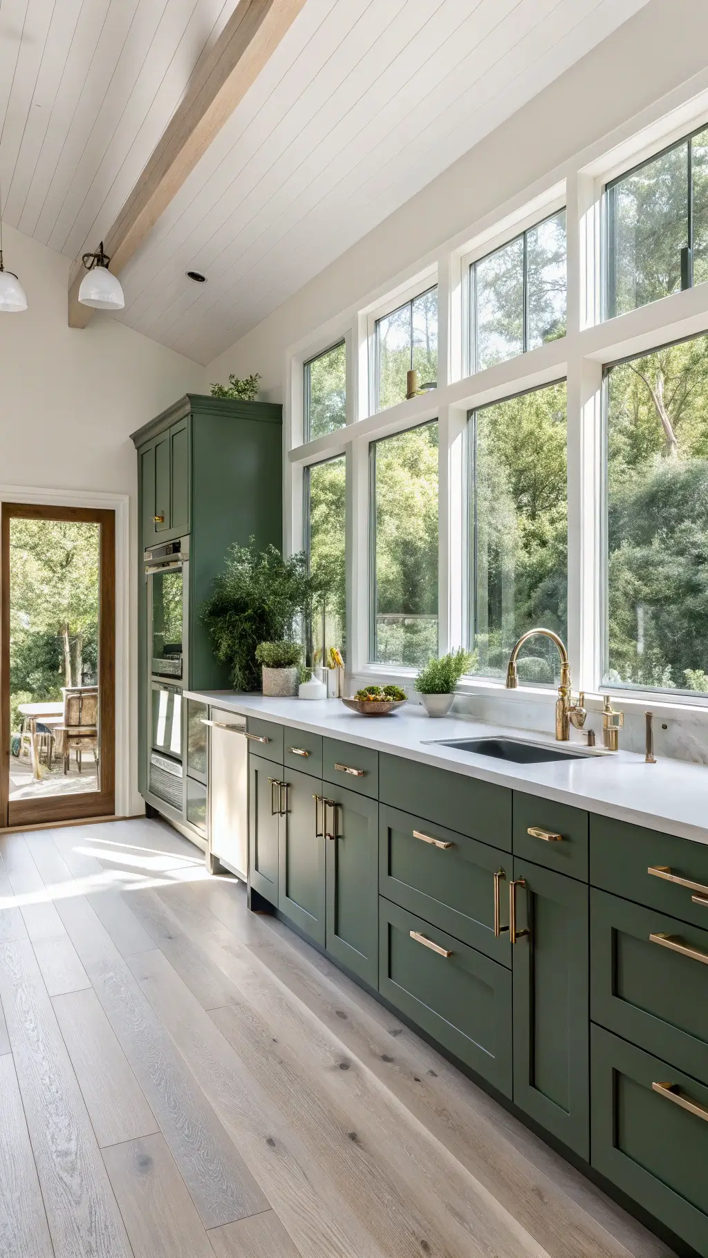
1. Earthy Green: Nature’s Palette Invades the Kitchen
Green isn’t just for gardens anymore. From soft sage to deep forest tones, earthy greens are taking over kitchen design. Here’s why:
- Creates a natural, organic atmosphere
- Works with both modern and traditional designs
- Connects your kitchen to the outdoors
- Brings life and energy to your cooking space
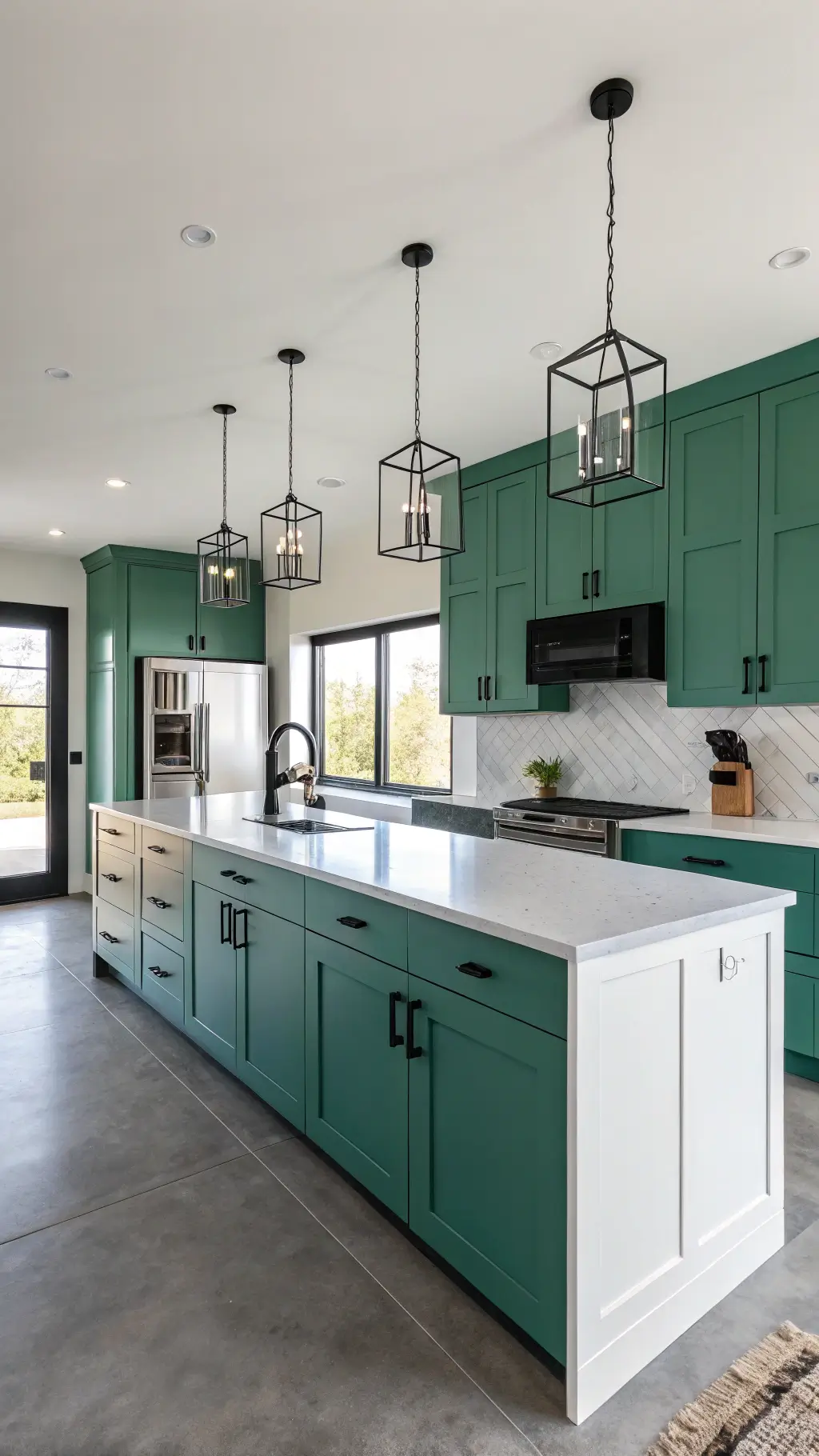
Pro Tip: Balsam 567 emerald tone is THE color designers are raving about this year.
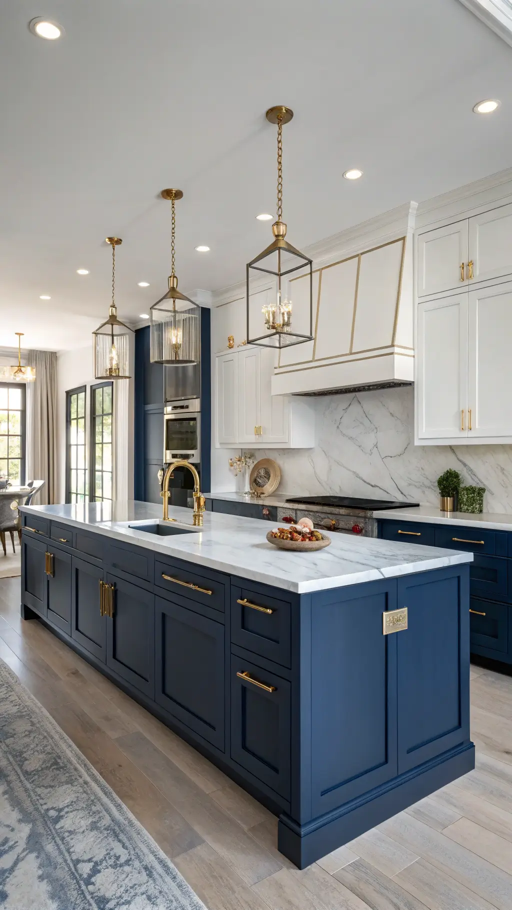
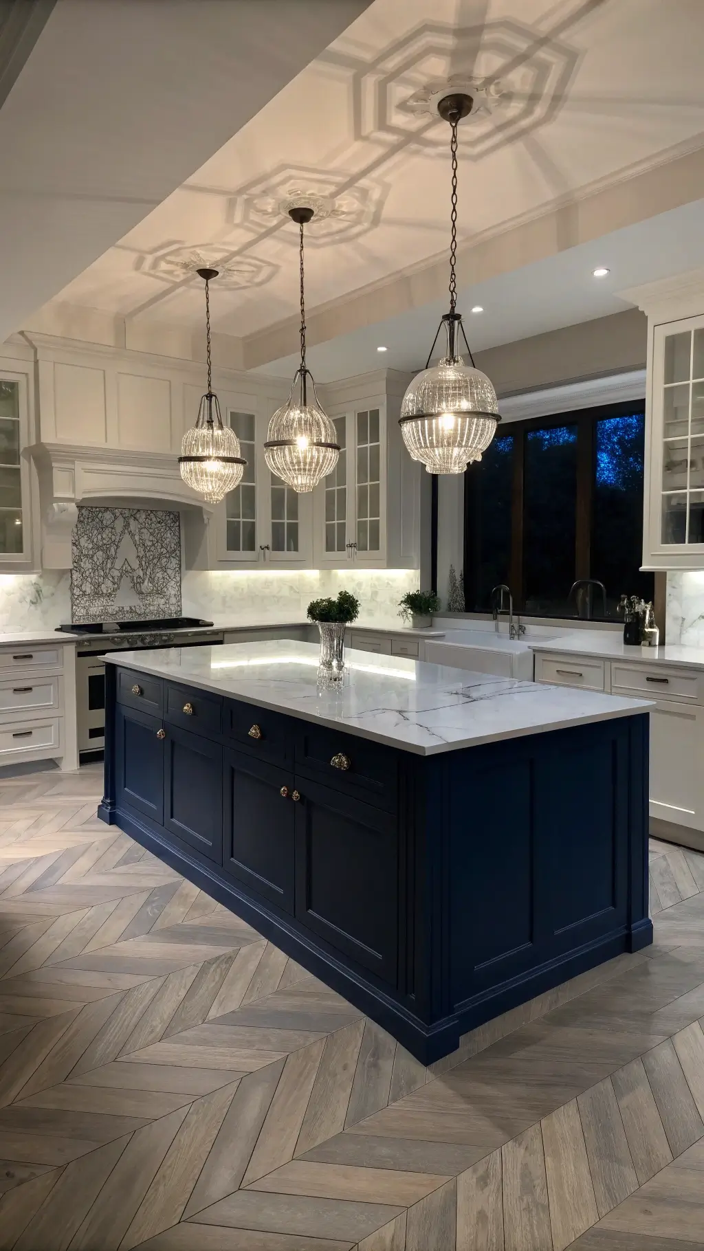
2. Navy Blue: Sophistication Meets Timeless Elegance
Navy blue cabinets are the James Bond of kitchen colors – classy, confident, and always stunning:
- Pairs perfectly with white countertops
- Adds depth and drama to your kitchen
- Works beautifully with brass and metallic hardware
- Recommended shade: Sea Mariner for maximum impact
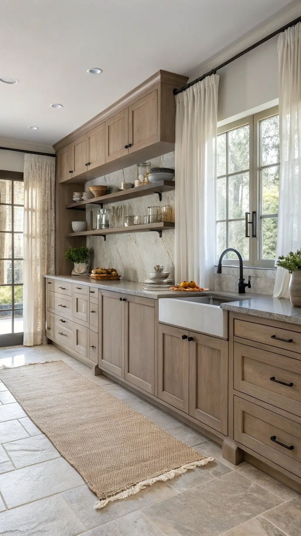
3. Warm Neutrals: Subtle Sophistication
Not ready for bold colors? Warm neutrals have got your back:
- Soft taupe creates a sophisticated backdrop
- Stained wood cabinets bring warmth
- Benjamin Moore’s Smokey Taupe: A designer’s secret weapon
- Creates a light, airy feel without feeling boring
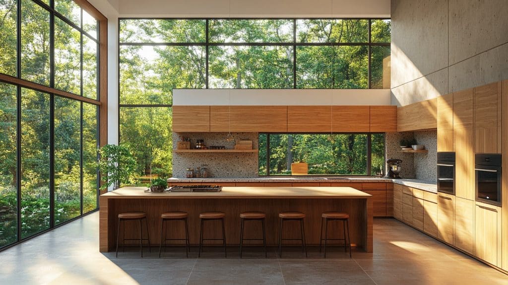
🖼 Steal This Look
- Paint Color: Sherwin-Williams Balsam SW 567
- Furniture: tapered leg walnut island with waterfall edge and integrated seating
- Lighting: oversized matte black linear pendant with hand-blown glass globes over island
- Materials: unlacquered brass hardware, honed Carrara marble countertops, rift-sawn white oak open shelving, hand-zellige tile backsplash
There’s something deeply satisfying about opening a cabinet painted in Balsam at 6 AM—it’s like the kitchen itself is rooting for you to make something nourishing.
Creative Color Combinations
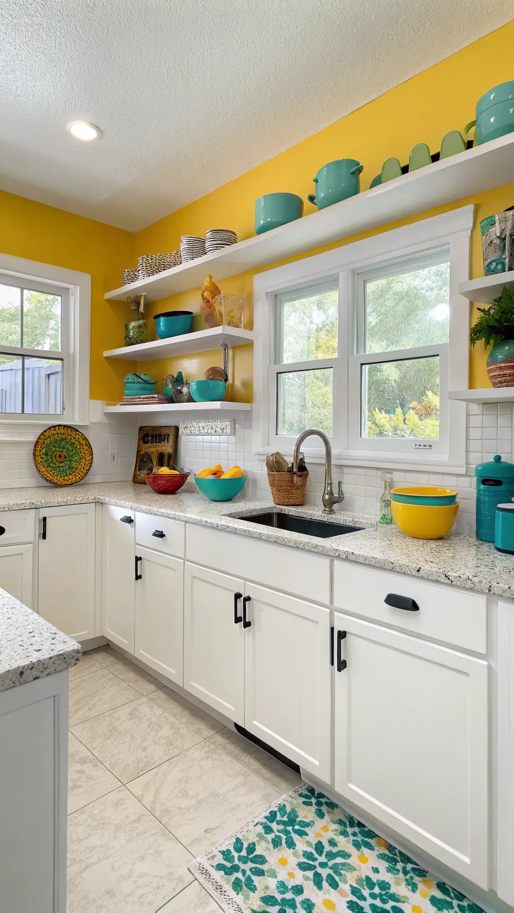
White + Bold Accents
White cabinets don’t have to be bland. Spice them up with:
- Sunflower yellow walls
- Colorful floating shelves
- Vibrant window mullions
Two-Tone Magic
Mix and match for visual interest:
- Navy blue island
- White perimeter cabinets
- Creates depth and personality
🎨 Steal This Look
- Paint Color: Benjamin Moore Sunflower 2019-40
- Furniture: navy blue painted kitchen island with shaker-style doors and brass hardware
- Lighting: schoolhouse pendant lights in matte black with brass accents
- Materials: white quartz countertops with subtle veining, natural oak floating shelves, brushed brass cabinet pulls
This combination works beautifully for homeowners who want personality without committing to an all-bold kitchen—it’s the best of both worlds.
🔔 Get The Look
Practical Color Selection Tips
Choosing the right cabinet color isn’t rocket science. Consider:
- Kitchen size (lighter colors = more space)
- Countertop materials
- Natural lighting
- Hardware finishes
Color Adaptation Hack: Chat Room – a magical gray-green that changes with lighting, making your kitchen look different throughout the day.
🌟 Steal This Look
- Paint Color: Farrow & Ball Mizzle 266
- Furniture: freestanding kitchen island with butcher block top in natural oak
- Lighting: schoolhouse glass pendant with aged brass canopy
- Materials: unlacquered brass, honed Carrara marble, wire-brushed white oak, hand-glazed ceramic tile
There’s something quietly satisfying about a kitchen that feels alive, shifting its mood from crisp morning coffee to soft evening wine—this is the room where those small daily rituals deserve a backdrop that keeps pace with your day.
Pro Designer Recommendations
- For country kitchens: Coastal Path AF-380 (nuanced greige)
- Bold statement color: Newburg Green HC-158 (captivating teal)
- Versatile neutral: Westcott Navy 1624
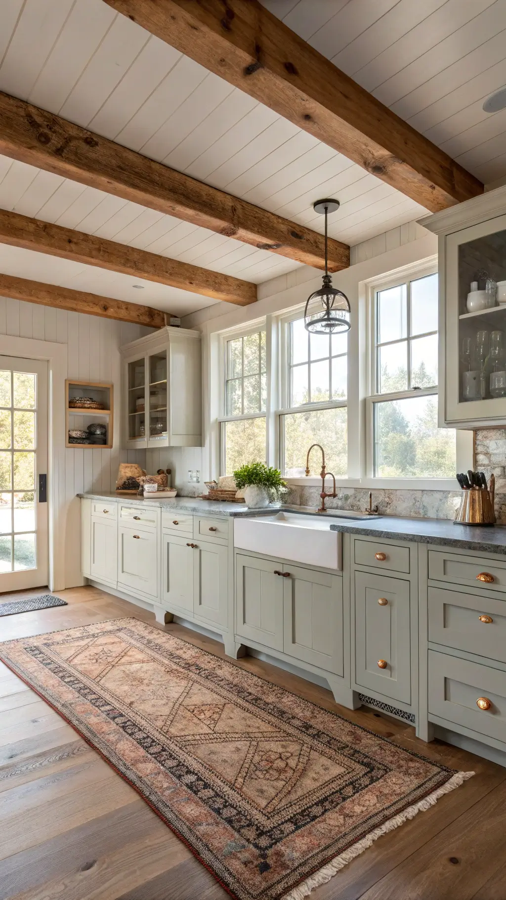
Warning: Avoid picking colors in isolation. Always get samples and test them in your actual kitchen lighting.
★ Steal This Look
- Paint Color: use Behr brand. Benjamin Moore Coastal Path AF-380 (match: Behr Wheat Bread 720C-3)
- Furniture: farmhouse-style pine harvest table with turned legs and distressed finish
- Lighting: oversized rattan pendant with visible Edison bulb
- Materials: reclaimed barn wood, hand-thrown pottery, woven rush seats, matte black iron hardware
Country kitchens should feel like they’ve evolved through generations of Sunday suppers, not like a catalog spread—your paint color is just the backdrop for the real memories you’ll make there.
👑 Get The Look
Final Thoughts
Your kitchen’s color can transform more than just walls – it changes how you feel about your entire home. Whether you’re a bold color enthusiast or a neutral lover, 2025’s palette has something for everyone.
Remember: The best kitchen is one that reflects your personality. Don’t just follow trends – make them work for you.
Happy painting, kitchen designers!