Mastering Color Harmony: Three-Color Palettes That Sing
Color is the silent language of design, and choosing the right color combination can transform any space from mundane to magnificent.
Classic Powerhouse Combinations
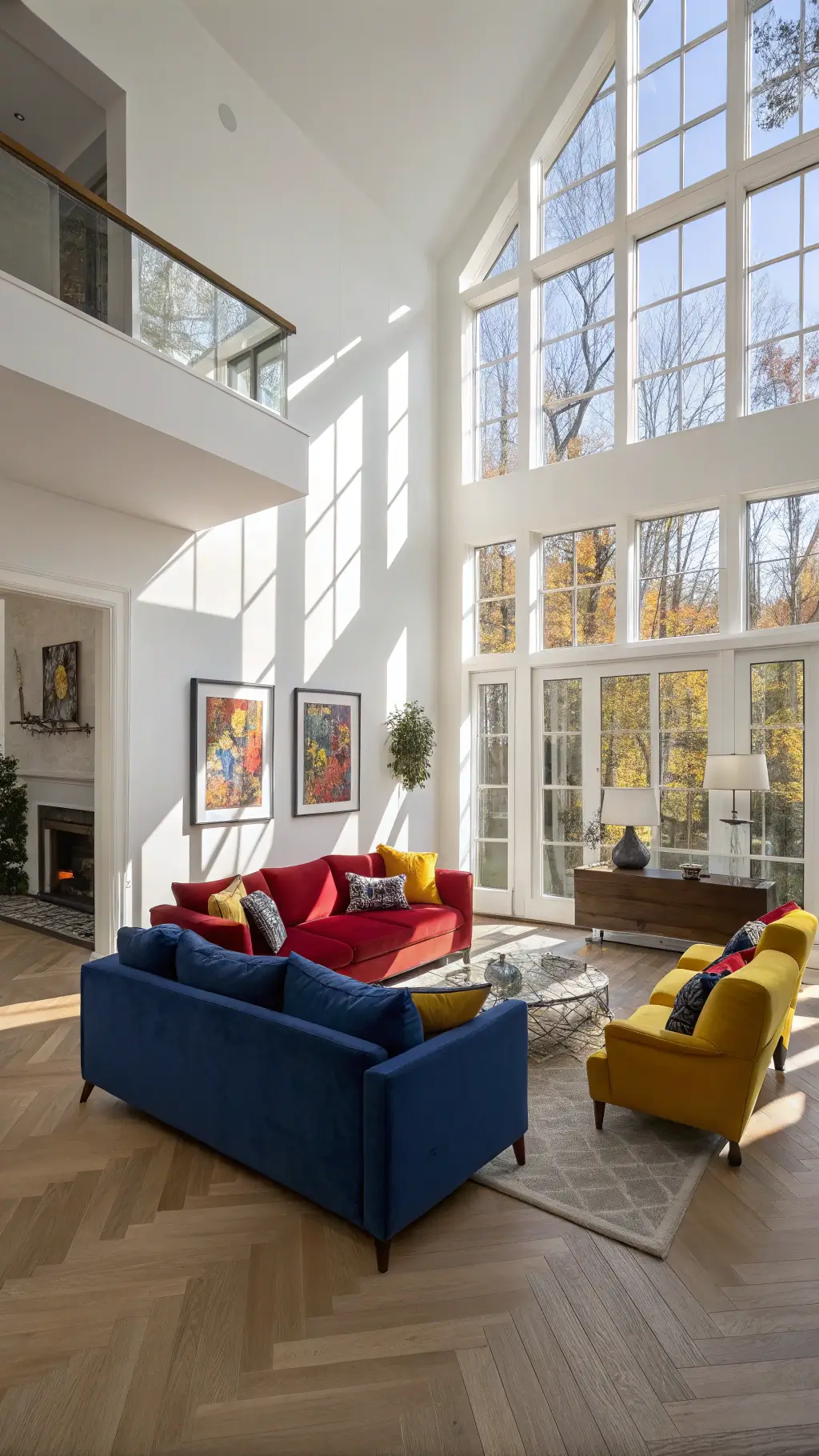
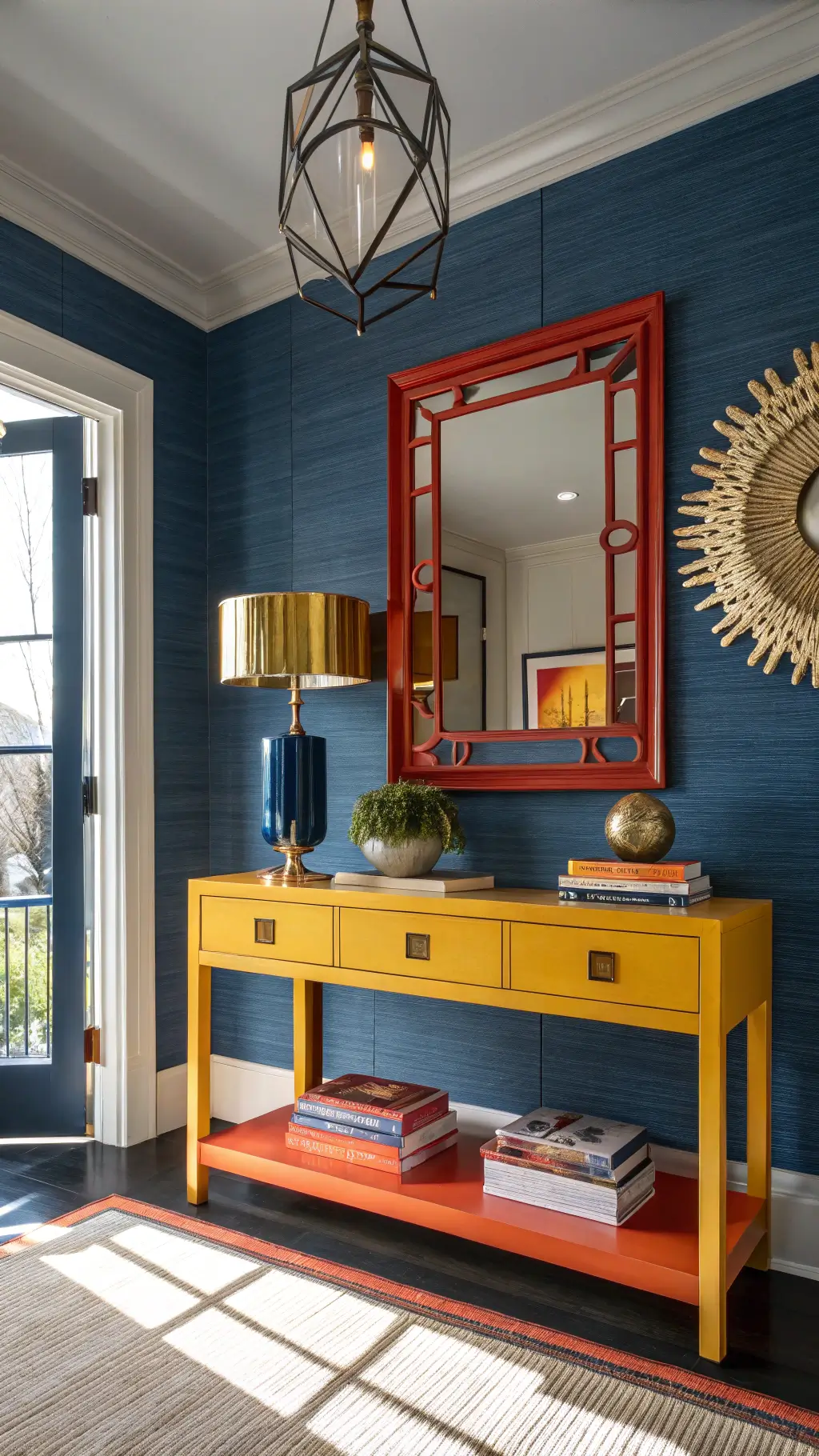
Primary Colors: Yellow, Red, and Blue
This timeless trio isn’t just for kindergarten art classes. These bold primary colors create a balanced, energetic palette that works everywhere:
- Perfect for modern living rooms
- Ideal for graphic design projects
- Creates instant visual impact
- Represents fundamental design principles
Contemporary Color Magic
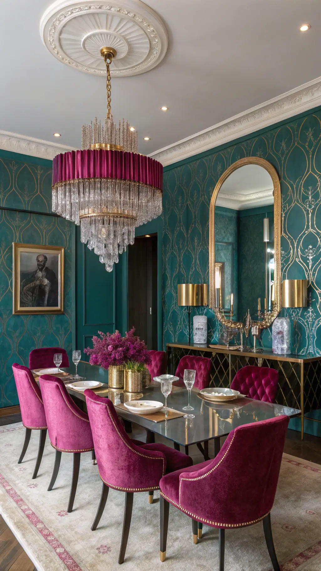
Unexpected Elegance: Teal, Magenta, and Gold
This trio screams contemporary sophistication:
- Blends cool and warm tones seamlessly
- Offers dynamic visual contrast
- Works brilliantly in modern interiors
- Feels luxurious and cutting-edge
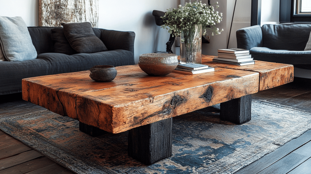
Sophisticated Minimalist Approach
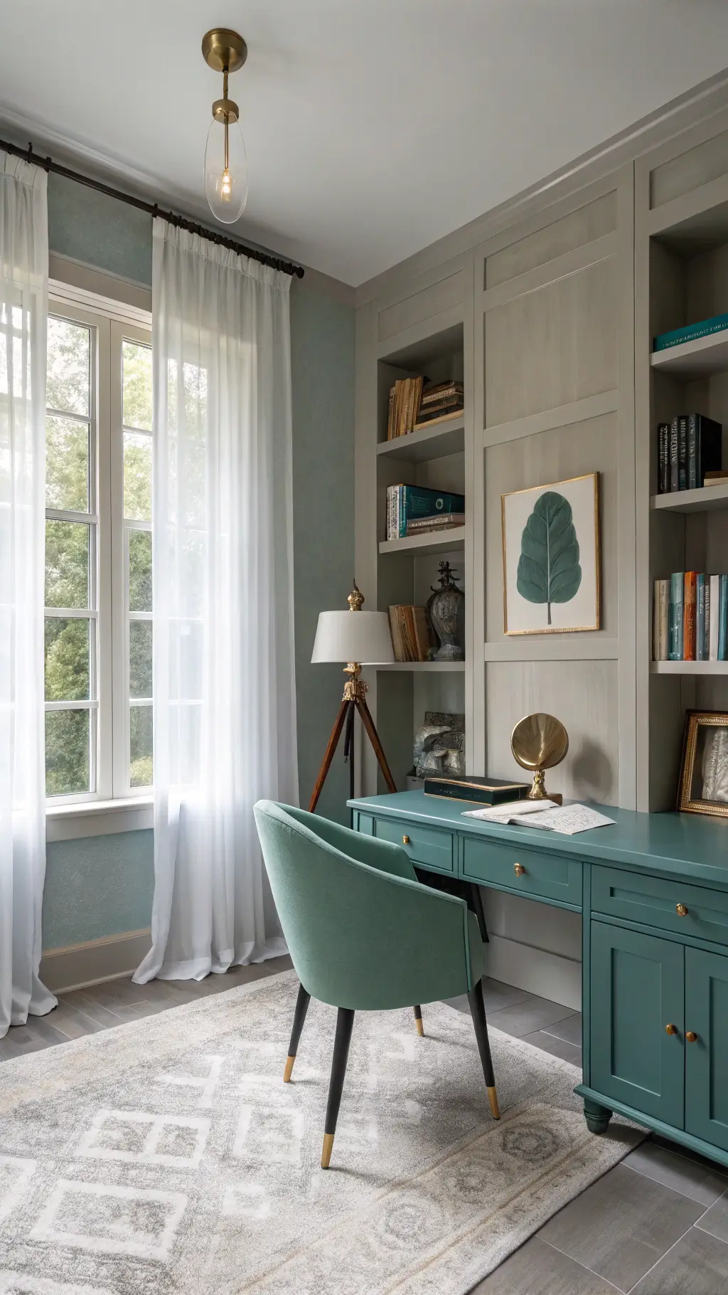
Refined Palette: Graystone, Teal, and Emerald
For those seeking understated elegance:
- Feels fresh and modern
- Perfect for minimalist spaces
- Evokes natural, calming environments
- Sophisticated without being overwhelming
Color Theory: Your Secret Weapon
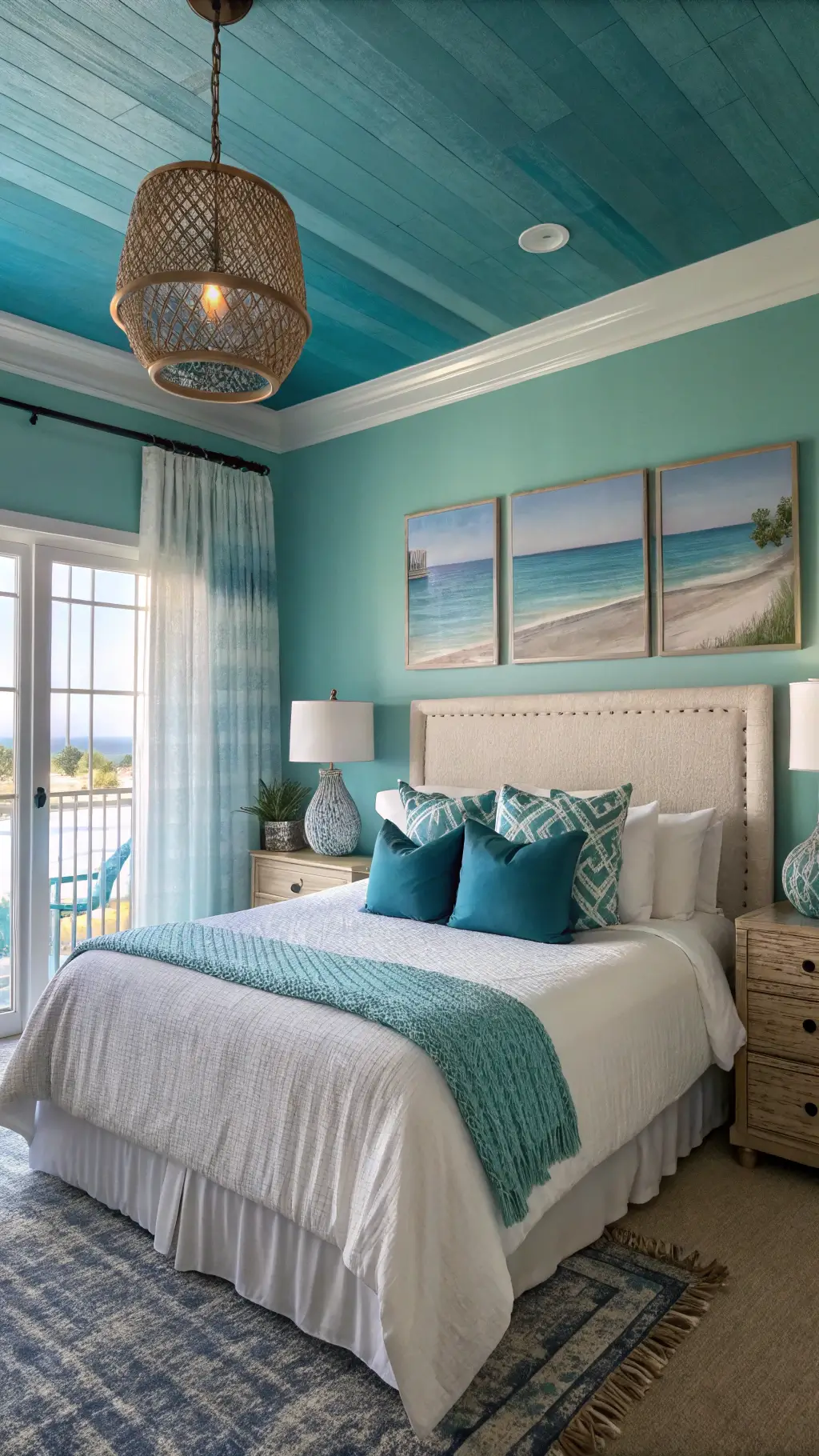
Analogous Color Schemes
Three adjacent colors on the wheel create harmony:
- Blue, teal, green
- Generates serene, unified looks
- Feels natural and cohesive
- Reduces visual tension
Split Complementary Technique
Create engaging contrasts strategically:
- Choose a base color
- Select colors adjacent to its complement
- Example: Blue + yellow-orange + red-orange
- Provides visual interest without overwhelming
Pro Tips for Color Selection
Digital Tools Make Perfect
Leverage technology to experiment:
- Adobe Color Wheel
- Canva’s Color Palette Generator
- Allows risk-free color exploration
- Provides precise color matching
Key Considerations
- Consider room lighting
- Test colors in actual space
- Use sample swatches
- Observe colors at different times of day

Color selection isn’t just science—it’s art. Trust your instincts, experiment boldly, and create spaces that truly reflect your personality.