Taupe Kitchen Cabinets: The Ultimate Neutral That Transforms Your Cooking Space
Tired of boring white kitchens or overwhelming dark cabinets? Taupe kitchen cabinets might just be your design soulmate.
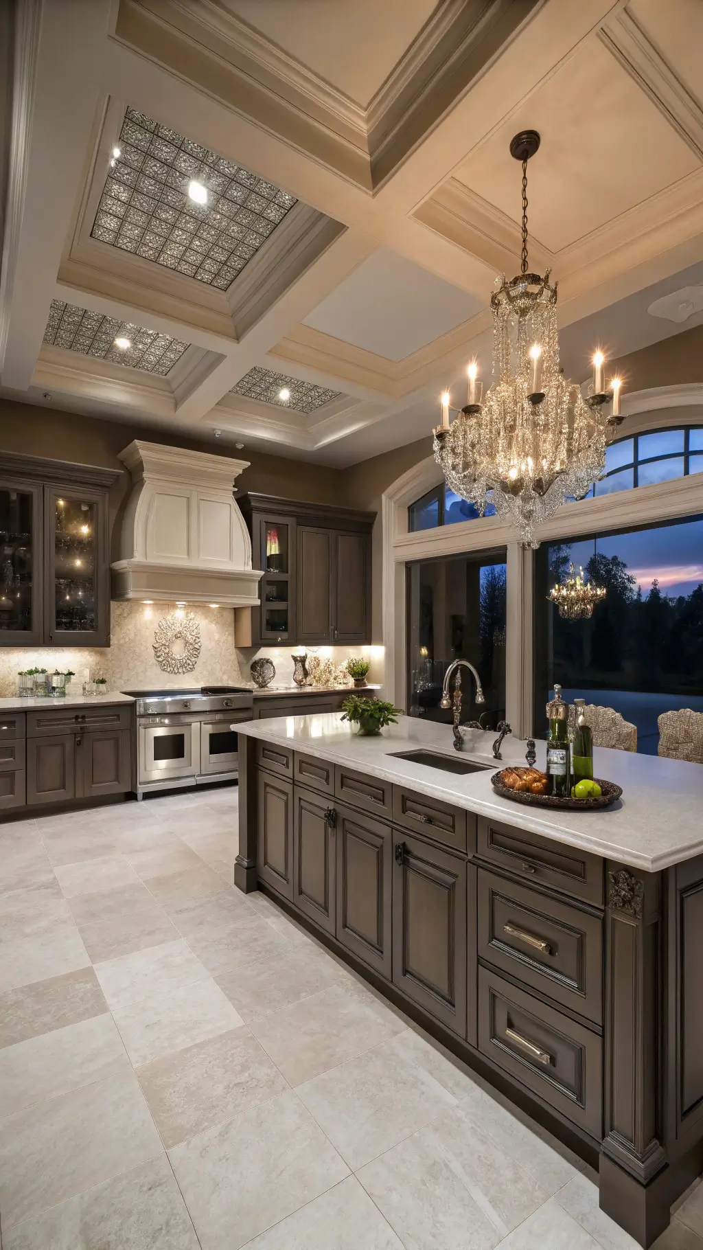
🖼 Steal This Look
- Paint Color: Sherwin-Williams Agreeable Gray SW 7029
- Furniture: tapered leg walnut counter stools with woven rush seats
- Lighting: oversized matte black dome pendant with brass interior
- Materials: honed Calacatta Viola marble, white oak floating shelves, unglazed zellige tile backsplash
There’s something deeply satisfying about a kitchen that feels both grounded and airy—taupe delivers that rare balance where morning coffee and evening wine both feel perfectly at home.
What Makes Taupe the Secret Weapon of Kitchen Design?
Imagine a color that’s like the chameleon of the design world. Taupe isn’t just another neutral—it’s a sophisticated blend of brown and gray that adapts faster than a chef switches cooking techniques.
Why Taupe Cabinets Are a Game-Changer
Key Advantages:
- Blends seamlessly with almost ANY design style
- Hides kitchen mess better than a magician’s trick
- Creates a warm, inviting atmosphere without trying too hard
![]()
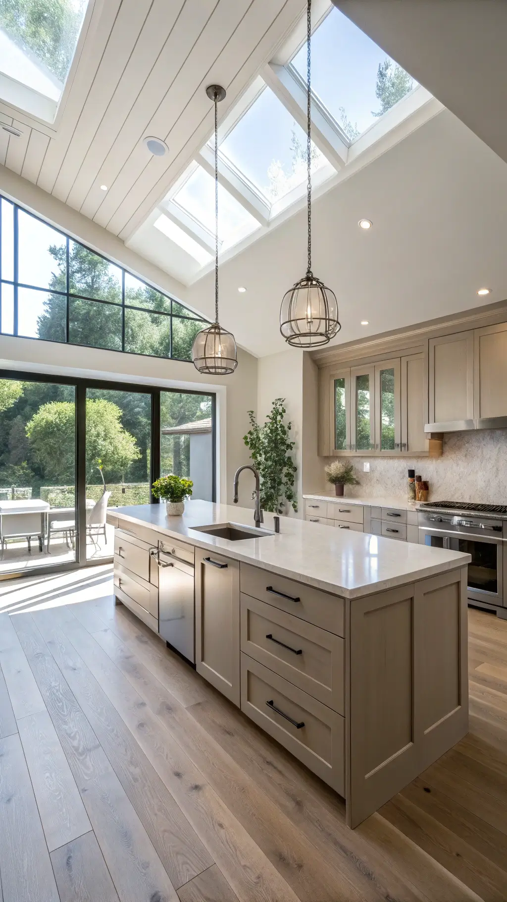
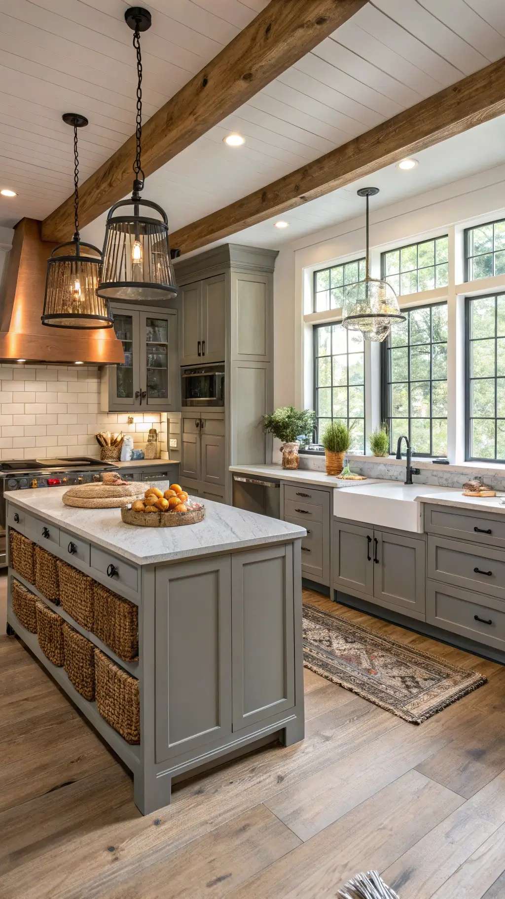
🎨 Steal This Look
- Paint Color: Benjamin Moore Revere Pewter HC-172
- Furniture: tapered leg counter stools with woven rush seats in natural oak finish
- Lighting: linear LED pendant with aged brass finish and ribbed glass shades over island
- Materials: honed Calacatta Gold marble countertops, white oak open shelving with live edge detail, unlacquered brass hardware with patina
There’s something quietly confident about walking into a taupe kitchen—it feels lived-in yet intentional, like the homeowner actually cooks here rather than just staging for photos.
Taupe Shade Showdown: Which One Fits Your Kitchen?
Not all taupes are created equal. Let’s break down the contenders:
1. Light Taupe: The Bright and Airy Option
- Perfect for smaller kitchens
- Makes spaces feel larger and more open
- Pairs brilliantly with white countertops and stainless steel
2. Medium Taupe: Sophistication Personified
- Adds warmth without overwhelming the space
- Looks stunning with marble countertops
- Brass hardware? Yes, please!
3. Dark Taupe: Dramatic and Luxurious
- Creates a bold statement
- Works magic with lighter countertops
- Ideal for those wanting a touch of drama

4. Gray Taupe: The Modern Minimalist’s Dream
- Sleek, contemporary feel
- Pairs perfectly with concrete and matte black finishes
- Screams “design-forward kitchen”

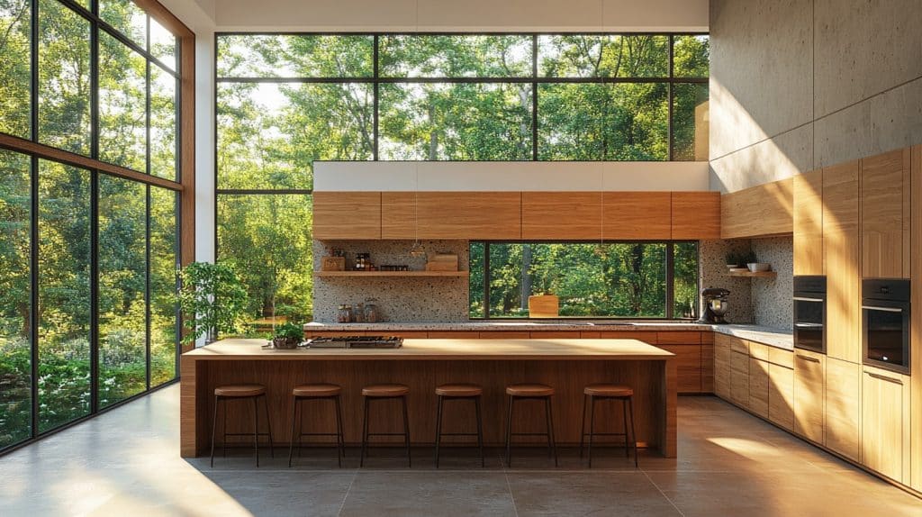
🖼 Steal This Look
- Paint Color: use Farrow & Ball brand. Match the ACTUAL wall color in the image. Format: Farrow & Ball ColorName CODE
- Furniture: kitchen island with waterfall quartz countertop in Calacatta Gold
- Lighting: pendant lights with aged brass finish and seeded glass shades
- Materials: honed marble backsplash, wire-brushed white oak flooring, unlacquered brass hardware
This is the decision that keeps homeowners up at night—standing in the paint aisle wondering if they’ve chosen ‘greige’ or ‘mushroom’—but getting your taupe right means loving your kitchen for the next fifteen years, not just the next fifteen months.
Pro Styling Tips That Designers Swear By
Design Hacks:
- Use under-cabinet lighting to prevent the space from feeling flat
- Mix in wood accents for warmth
- Add pops of color through accessories
- Experiment with different textures and materials
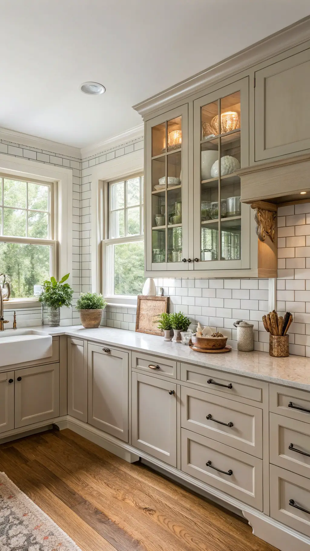
🖼 Steal This Look
- Paint Color: use Behr brand. Match the ACTUAL wall color in the image. Format: Behr Swiss Coffee 12
- Furniture: slim-profile walnut bar stools with woven rush seats
- Lighting: LED under-cabinet puck lights with warm 2700K dimmable output
- Materials: honed Carrara marble countertops, brushed brass hardware, reclaimed oak open shelving, linen-textured roman shades
This is the room where morning coffee becomes ritual and dinner prep turns into family gathering—taupe’s chameleon quality means it adapts to every mood, every season, every life stage you’re in.
Top Taupe Paint Colors Designers Love
- “Perfect Greige”: The warm, medium-dark champion
- “Agreeable Gray”: Neutral with a capital N
- “Modern Gray”: Soft and sophisticated
Practical Realities: Beyond the Pretty Pictures
Taupe isn’t just about looking good. These cabinets are:
- Low-maintenance
- Dirt and smudge resistant
- Incredibly versatile for future design changes
Real Talk: Is Taupe Right for You?
Ask yourself:
- Do you want a timeless kitchen?
- Are you tired of extreme color choices?
- Need flexibility in your design?
If you nodded yes, taupe is calling your name.
Final Thoughts
Taupe kitchen cabinets aren’t just a color choice—they’re a lifestyle statement. They whisper sophistication while screaming practicality.
Pro Tip: Always test paint samples in your specific kitchen lighting. What looks perfect in the store might change dramatically at home.
Ready to transform your kitchen? Taupe is waiting.