Hey there, kitchen design enthusiasts!
Let’s dive into the magical world of powder blue cabinets – the secret weapon for creating a kitchen that feels like a breath of fresh air.
★ Steal This Look
- Paint Color: Sherwin-Williams Rainwashed SW 6211
- Furniture: slipcovered linen bar stools with weathered oak legs
- Lighting: schoolhouse pendant with aged brass hardware
- Materials: honed Carrara marble countertops, unlacquered brass pulls, white oak open shelving
There’s something quietly nostalgic about powder blue in a kitchen—it reminds me of my grandmother’s farmhouse sink, yet feels completely fresh when balanced with organic textures.
Why Powder Blue? The Ultimate Kitchen Makeover
I’ve seen countless kitchen transformations, but powder blue cabinets are something special. They’re not just a color – they’re a mood, a statement, and a total game-changer for your home.
Key Benefits of Powder Blue Cabinets:
- Creates an instant sense of calm
- Makes spaces feel larger and brighter
- Works with multiple design styles
- Adds a touch of sophisticated softness
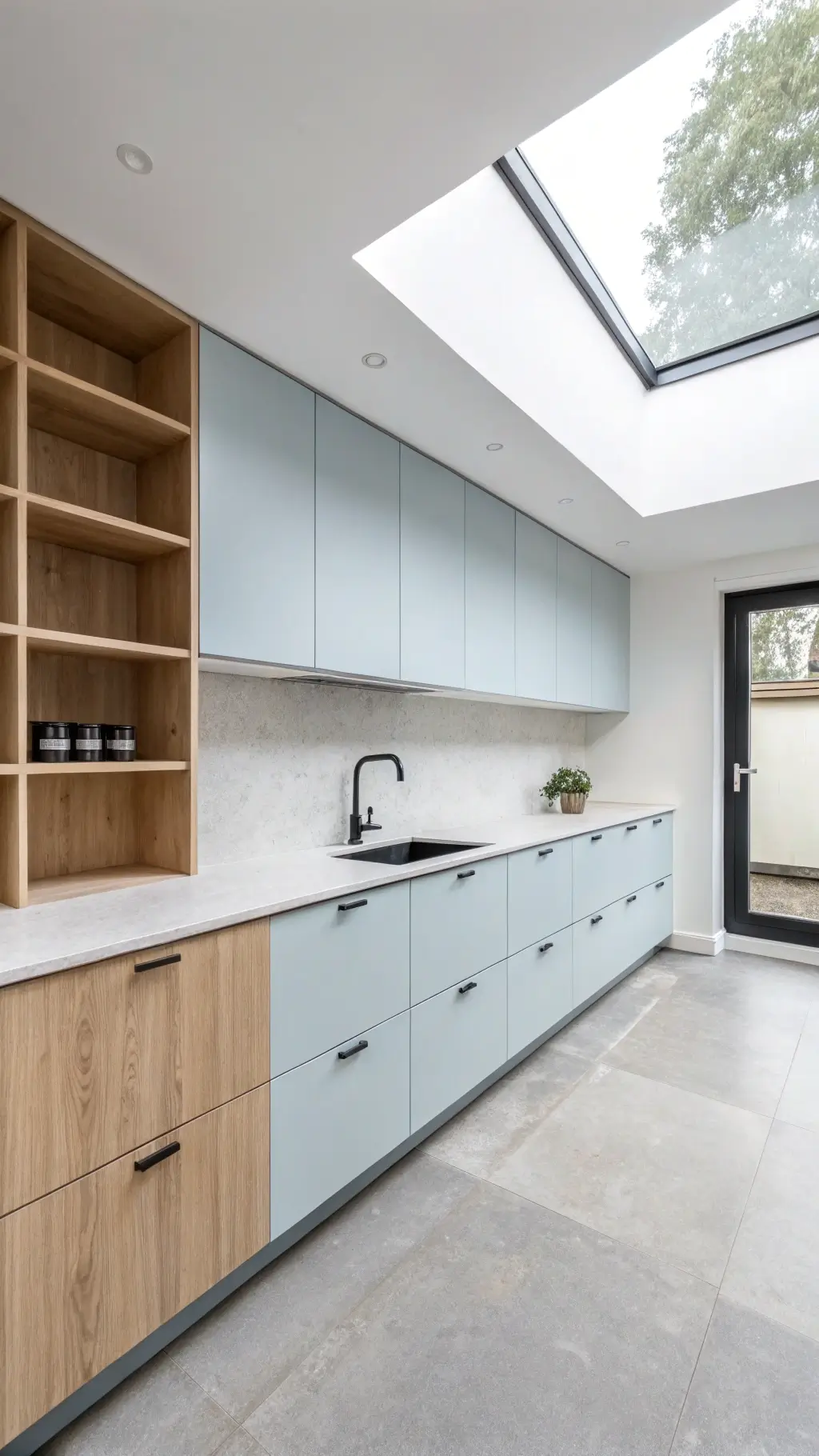
💡 Steal This Look
- Paint Color: Benjamin Moore Breath of Fresh Air 806
- Furniture: vintage-inspired farmhouse dining table with turned legs in whitewashed oak
- Lighting: Schoolhouse Electric Satellite 3 pendant in aged brass with white opal glass
- Materials: honed Carrara marble countertops, unlacquered brass hardware, white oak floating shelves, zellige tile backsplash in warm white
There’s something deeply personal about a powder blue kitchen—it feels like the first deep breath on a slow Sunday morning, and guests always linger longer without knowing exactly why.
Design Versatility: From Coastal to Contemporary
Powder blue isn’t just a one-trick pony. This magical hue slides seamlessly into multiple design aesthetics:
- Coastal Chic
- Modern Traditional
- Farmhouse Charm
- Scandinavian Minimalism
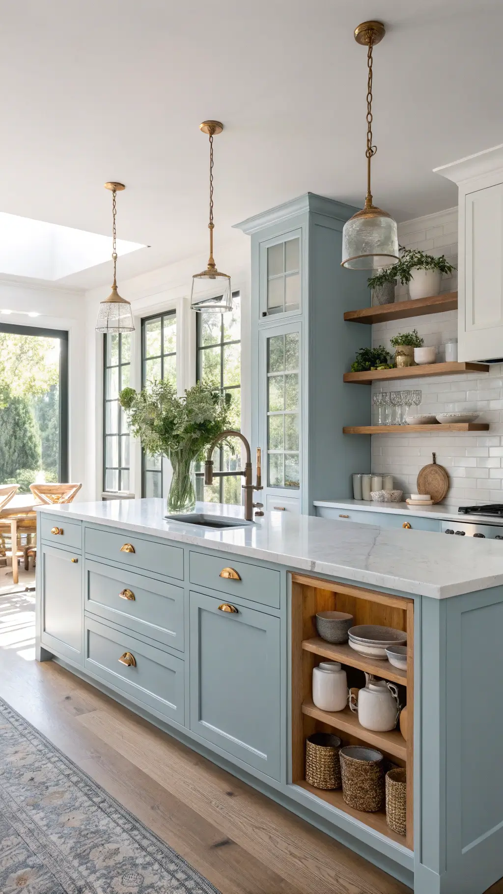
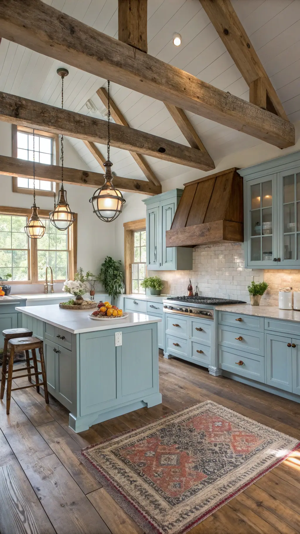
★ Steal This Look
- Paint Color: Farrow & Ball Borrowed Light 235
- Furniture: Shaker-style inset cabinetry with unlacquered brass cup pulls, paired with a white oak waterfall island
- Lighting: Schoolhouse Electric Satellite 3 pendant in aged brass with milk glass globes
- Materials: Hand-glazed zellige tile backsplash in weathered white, honed Carrara marble countertops, natural seagrass runner, weathered driftwood open shelving
I’ve watched powder blue kitchens feel instantly dated when homeowners force them into a single aesthetic box—the beauty of this color is its chameleon quality, so let it breathe between styles rather than committing too hard to coastal rope details or overly stark modern minimalism.
Choosing the Perfect Powder Blue
Not all blues are created equal. When selecting your perfect shade, consider:
- Natural light in your kitchen
- Existing color palette
- Undertones (warm vs. cool)
- Complementary surfaces (countertops, backsplash)
Pro Tip: Always test paint samples in different lights before committing!
✎ Steal This Look
- Paint Color: Behr Light French Gray PPU18-05
- Furniture: shaker-style base cabinets in powder blue with matching island
- Lighting: brushed nickel pendant lights with clear glass shades over island
- Materials: white quartz countertops, brushed brass hardware, natural oak open shelving
There’s something quietly confident about walking into a kitchen that doesn’t shout for attention—powder blue gives you that settled, Sunday morning feeling every single day.
Budget-Friendly Transformation Options
DIY Paint Project: $200-$500
- Sand existing cabinets
- Prime thoroughly
- Use high-quality cabinet paint
- Add new hardware for extra impact
Professional Refinishing: $1,500-$3,000
- Complete color change
- Professional prep and finish
- Guaranteed durability
- Minimal disruption to your kitchen
🎨 Steal This Look
- Paint Color: use Valspar brand. Match the ACTUAL wall color in the image. Format: Valspar ColorName CODE
- Furniture: specific furniture for this room
- Lighting: specific lighting fixture
- Materials: key textures and materials
There’s something deeply satisfying about opening a cabinet door you painted yourself and seeing that perfect powder blue interior—it’s the kind of quiet pride that makes the kitchen feel truly yours without the guilt of a splurge.
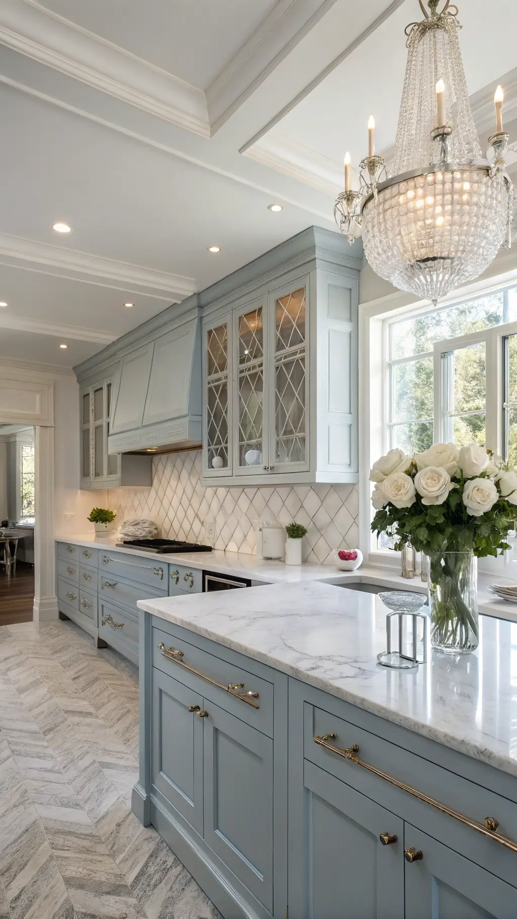
Styling Your Powder Blue Kitchen
Color Companions:
- Crisp white countertops
- Light wood accents
- Brushed nickel or brass hardware
- Subtle ceramic accessories
Styling Do’s:
- Layer natural textures
- Use minimal, intentional decor
- Create visual depth with subtle patterns
- Incorporate greenery or herbs
Common Mistakes to Avoid:
- Overwhelming the space with too much blue
- Choosing the wrong undertone
- Neglecting lighting considerations
- Forgetting about hardware coordination
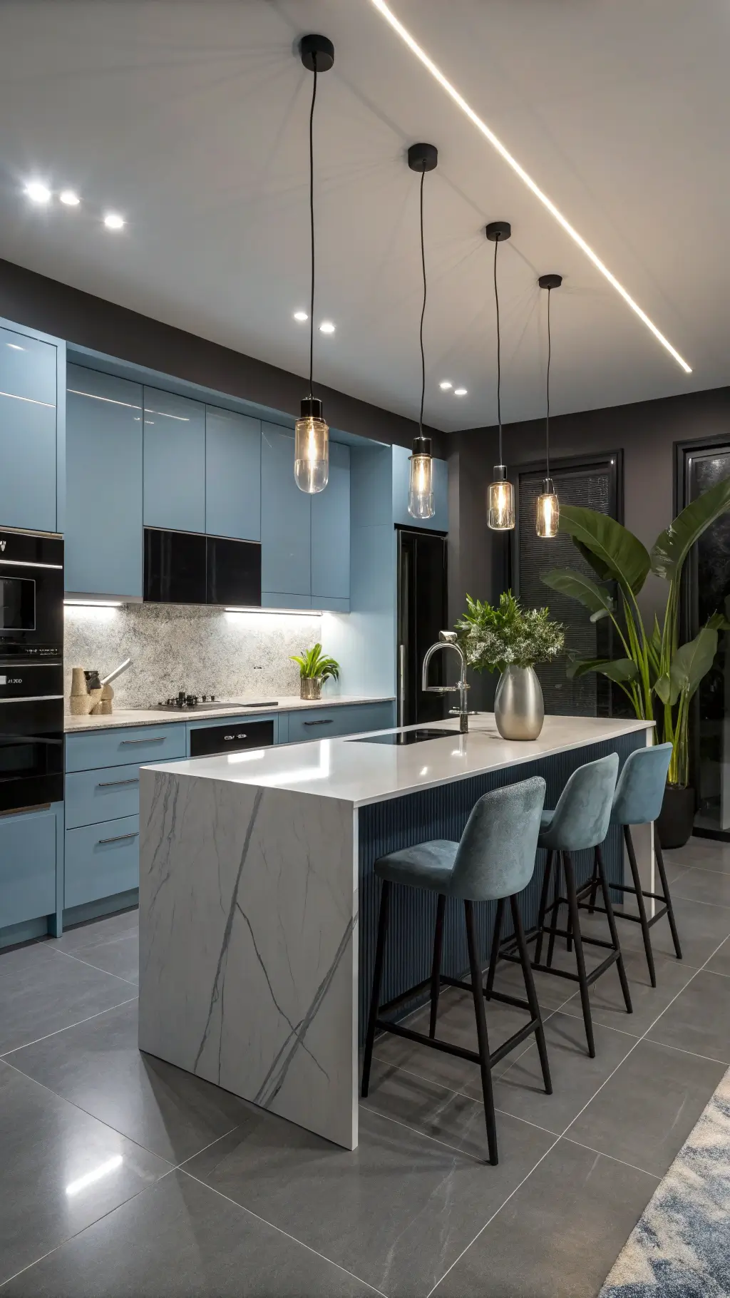
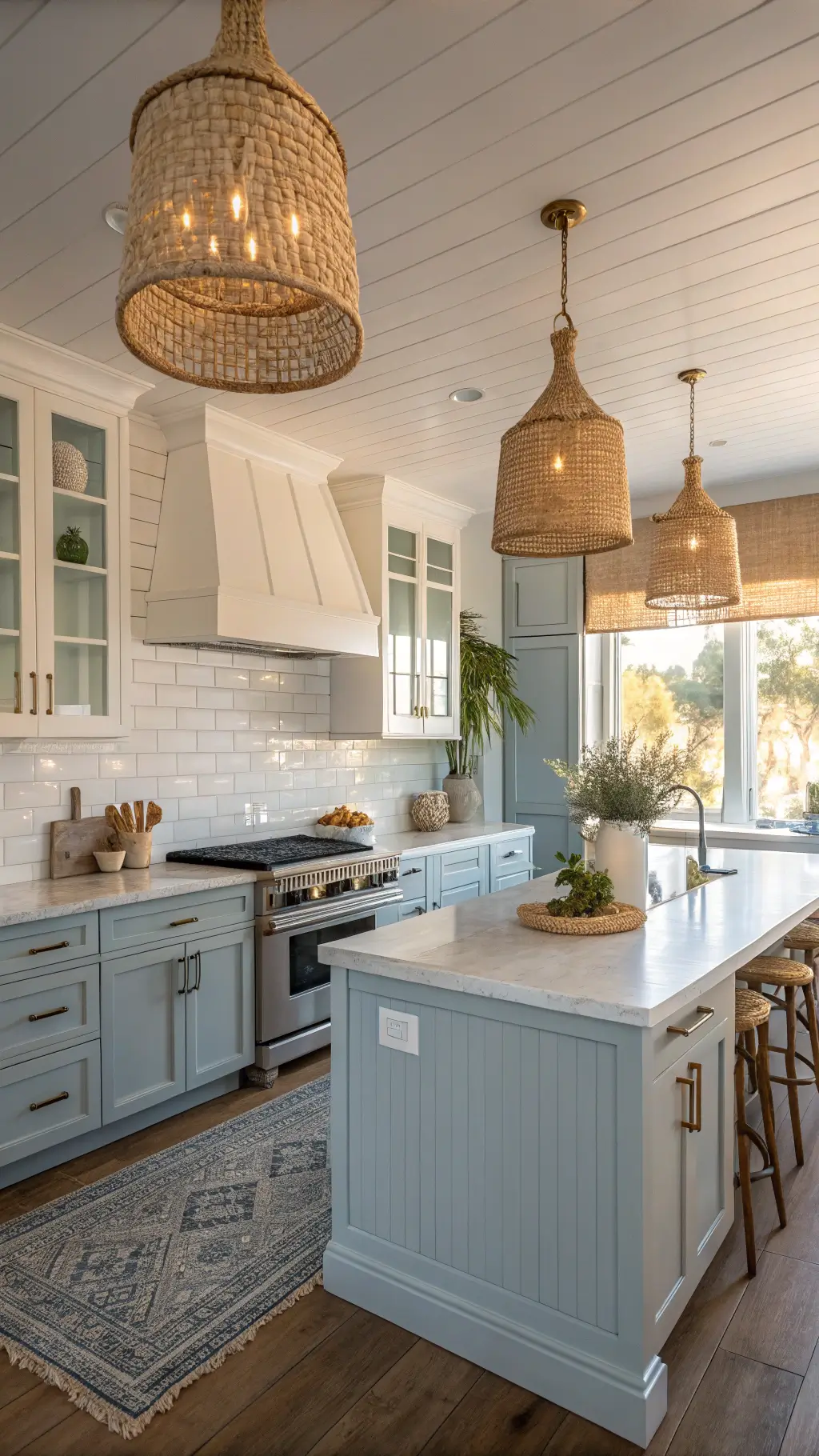
🌟 Steal This Look
- Paint Color: use PPG brand. Match the ACTUAL wall color in the image. Format: PPG Delicate Blue PPG1156-3
- Furniture: tapered-leg oak bar stools with woven rush seats
- Lighting: linear brass pendant with frosted glass globes over the island
- Materials: honed Carrara marble, white oak, unglazed terracotta, brushed brass, natural linen
This kitchen should feel like Sunday morning—unhurried, breathable, quietly pulled together. The blue sets the mood, but it’s the restraint in styling that keeps it from feeling like a showroom.
Photography and Social Media Tips
If you’re planning to showcase your powder blue kitchen:
- Shoot during soft, natural light
- Use a clean, uncluttered approach
- Capture different angles
- Focus on texture and subtle details
![]()
★ Steal This Look
- Paint Color: Dunn-Edwards Powder Blue DEW383
- Furniture: open shelving with brass brackets displaying white ceramic dishware
- Lighting: schoolhouse pendant with milk glass shade over the island
- Materials: matte powder blue cabinet finish, honed Carrara marble countertops, unlacquered brass hardware, white oak floating shelves
There’s something quietly satisfying about a powder blue kitchen that photographs beautifully without trying too hard—it’s the kind of space that feels lived-in and intentional, the sweet spot every home content creator chases.
Personal Insight: My Powder Blue Journey
When I first experimented with powder blue in my own kitchen, I was nervous. Would it feel too bold? Too clinical? But the transformation was nothing short of magical. The space instantly felt more open, more breathing, more… me.
Final Thoughts: More Than Just a Color
Powder blue cabinets are more than a trend – they’re a lifestyle choice. They represent calm, sophistication, and a fresh approach to home design.
Whether you’re a minimalist, a coastal lover, or someone seeking a serene cooking space, powder blue offers something uniquely transformative.
Budget:
Flexible
Difficulty:
Moderate
Satisfaction:
Guaranteed
Ready to transform your kitchen? Powder blue is calling your name.