Why Pale Oak Is Your Kitchen’s Secret Weapon
Pale Oak isn’t just another paint color. It’s a design chameleon that transforms your kitchen with subtle sophistication. Here’s why designers and homeowners are falling head over heels:
Key Highlights:
- Warm greige that adapts to different lighting
- Versatile enough to complement multiple design styles
- Creates an inviting, bright kitchen atmosphere
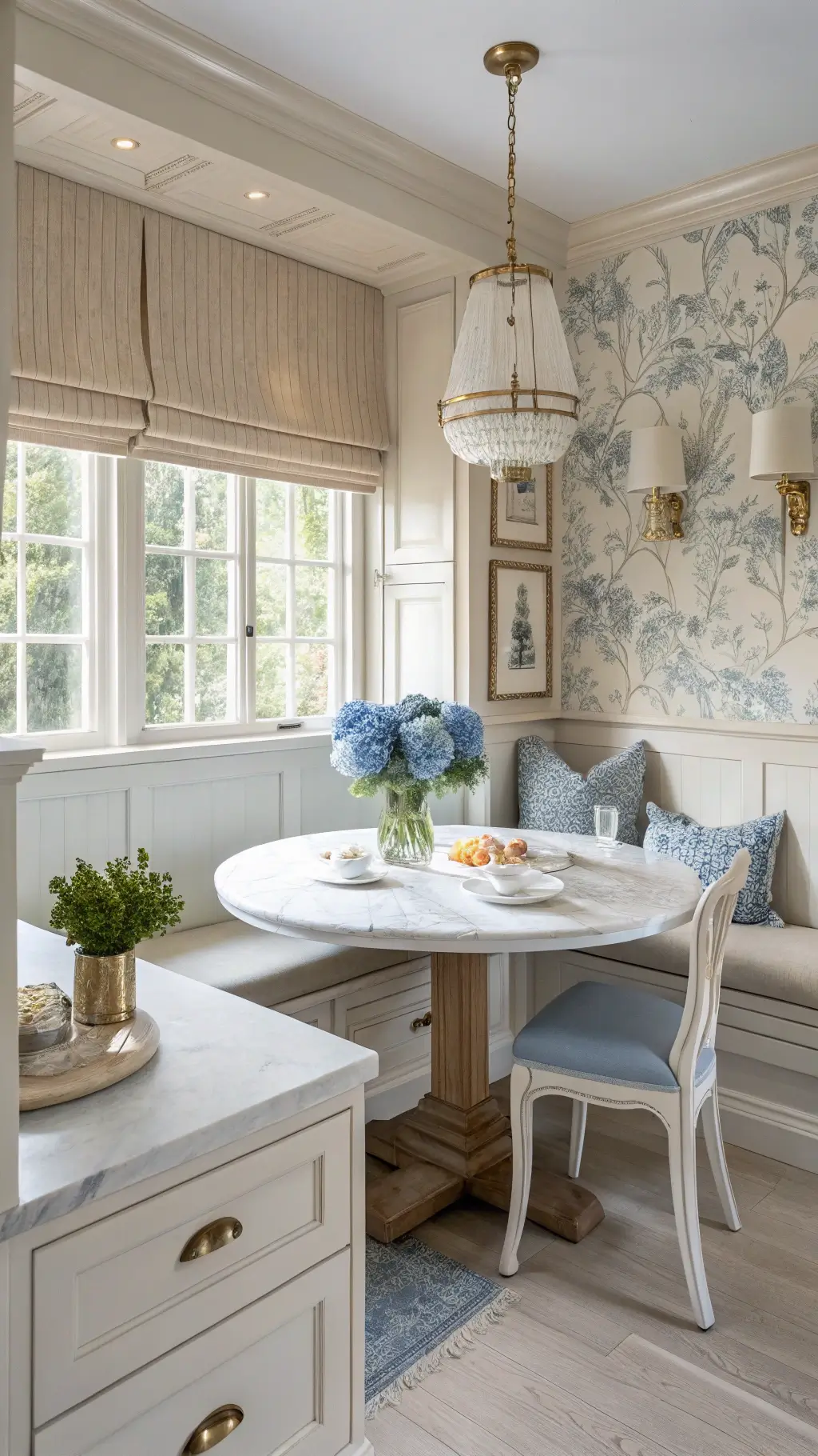
![]()
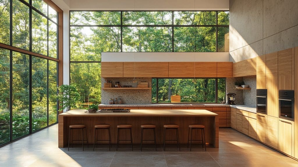
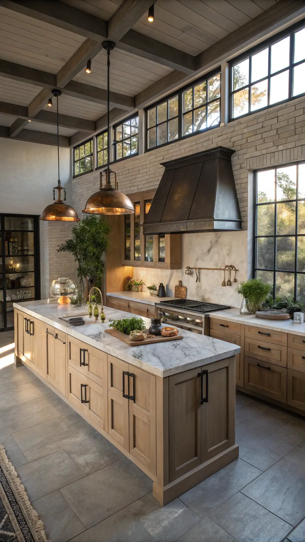
✎ Steal This Look
- Paint Color: Sherwin-Williams Pale Oak OC-20
- Furniture: white oak dining table with turned legs, woven rush seat counter stools, antique brass pot rack
- Lighting: schoolhouse glass pendant lights in aged brass finish
- Materials: quarter-sawn white oak, honed Carrara marble, unlacquered brass, natural linen, vintage terracotta
There’s something quietly confident about a Pale Oak kitchen—it doesn’t demand attention but earns it through sheer livability, aging gracefully as your life unfolds around it.
The Color Science Behind Pale Oak
Think of Pale Oak as the Swiss Army knife of paint colors. In bright spaces, it’s a light neutral that whispers elegance. In dimmer rooms, it wraps the space in a cozy, sophisticated embrace.
Perfect Pairings That Make Pale Oak Shine
Countertop Magic:
- Taj Mahal Quartzite: A match made in design heaven
- Soft white quartz for a clean, crisp look
- Warm marble for added depth and texture
Hardware That Elevates:
- Brass fixtures add warmth and sophistication
- Aged brass knobs create an instant designer feel
- Matte black hardware for a modern twist
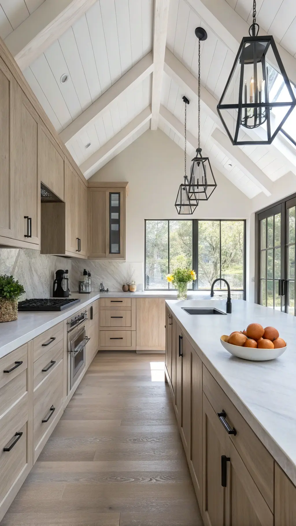
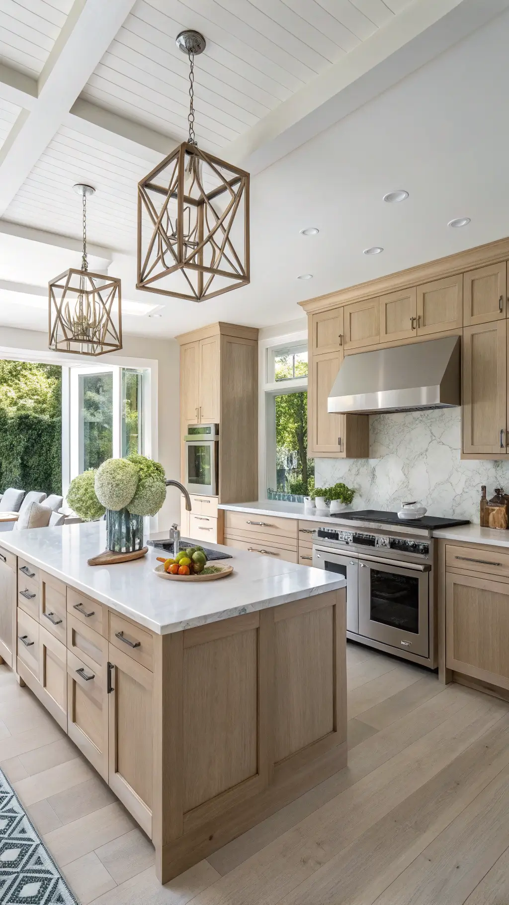
🖼 Steal This Look
- Paint Color: Benjamin Moore Pale Oak OC-20
- Furniture: Taj Mahal quartzite waterfall island with live-edge oak bar stools
- Lighting: Rejuvenation Haleigh Wire Dome Pendant in aged brass
- Materials: Wire-brushed white oak, honed Taj Mahal quartzite, unlacquered brass, natural linen
I’ve watched Pale Oak transform cramped galley kitchens into airy, expensive-feeling spaces—it’s the color I suggest when clients want ‘warm white’ without the clinical starkness.
Styling Tips That Work Every Single Time
Wall Color Combos:
- Benjamin Moore White Dove: Soft and seamless
- Sherwin Williams Pure White: Creates crisp contrast
- Avoid Cloud White – it can clash with Pale Oak’s undertones
Pro Designer Tip: Pale Oak works magic in south-facing kitchens, maintaining its true neutral character even in warm afternoon light.
★ Steal This Look
- Paint Color: Farrow & Ball Pointing 2003
- Furniture: vintage-inspired oak dining table with turned legs
- Lighting: schoolhouse glass pendant with aged brass hardware
- Materials: unlacquered brass, honed Carrara marble, woven rattan, raw linen
This is the kitchen you’ll actually want to cook in—warm enough for Sunday morning pancakes, neutral enough to evolve with your taste over a decade.
What the Experts Are Saying
Top designers agree: Pale Oak isn’t just a trend – it’s a timeless solution for those wanting to break free from boring white cabinets without going bold.
Who Should Choose Pale Oak?
Perfect For:
- Homeowners seeking a versatile neutral
- Kitchens with varying light conditions
- Those planning a whole-house color palette
Not Ideal For:
- Spaces needing dramatic color statements
- North-facing rooms with limited natural light
🌟 Steal This Look
- Paint Color: Behr Swiss Coffee 12
- Furniture: vintage-inspired oak dining table with turned legs
- Lighting: schoolhouse pendant in aged brass with milk glass shade
- Materials: unlacquered brass hardware, honed Carrara marble, woven rattan bar stools
There’s something deeply reassuring about a kitchen that feels collected over time rather than staged—Pale Oak gives you that lived-in warmth from day one, like your grandmother’s kitchen updated for how you actually cook and gather.
Real-World Application Insights
Recent design publications in 2024 and 2025 continue to highlight Pale Oak as a go-to choice for kitchen transformations. It’s not just a color – it’s a design strategy.
Installation Pro Tips
- Test large swatches in different lighting
- Consider your kitchen’s natural light exposure
- Use premium paint for best color depth and durability
🌟 Steal This Look
- Paint Color: Valspar Pale Oak 6005-1B
- Furniture: Bassett Furniture custom kitchen island with turned legs in matching Pale Oak finish
- Lighting: Rejuvenation Haleigh Wire Dome Pendant in aged brass
- Materials: honed Calacatta Gold marble, white oak open shelving, unlacquered brass hardware, natural linen Roman shades
I’ve walked through enough showrooms to know that Pale Oak looks deceptively different under fluorescent lighting versus the warm glow you’ll actually cook under—trust your morning and evening swatch tests more than the paint store’s lighting.
The Bottom Line
Pale Oak by Benjamin Moore isn’t just a paint color. It’s a design solution that bridges the gap between traditional and contemporary, creating spaces that feel both timeless and totally now.
Quick Decision Maker:
- Need warmth? ✓
- Want versatility? ✓
- Desire designer-level sophistication? ✓
Pale Oak checks every single box.