Why Powder Blue? The Color That Changes Everything
Powder blue isn’t just another paint shade. It’s a design game-changer that breathes life into kitchens without overwhelming the space.
Key Advantages:
- Creates instant visual calm
- Functions like a neutral with personality
- Makes spaces feel larger and more open
- Works across multiple design aesthetics
- Timeless yet contemporary appeal
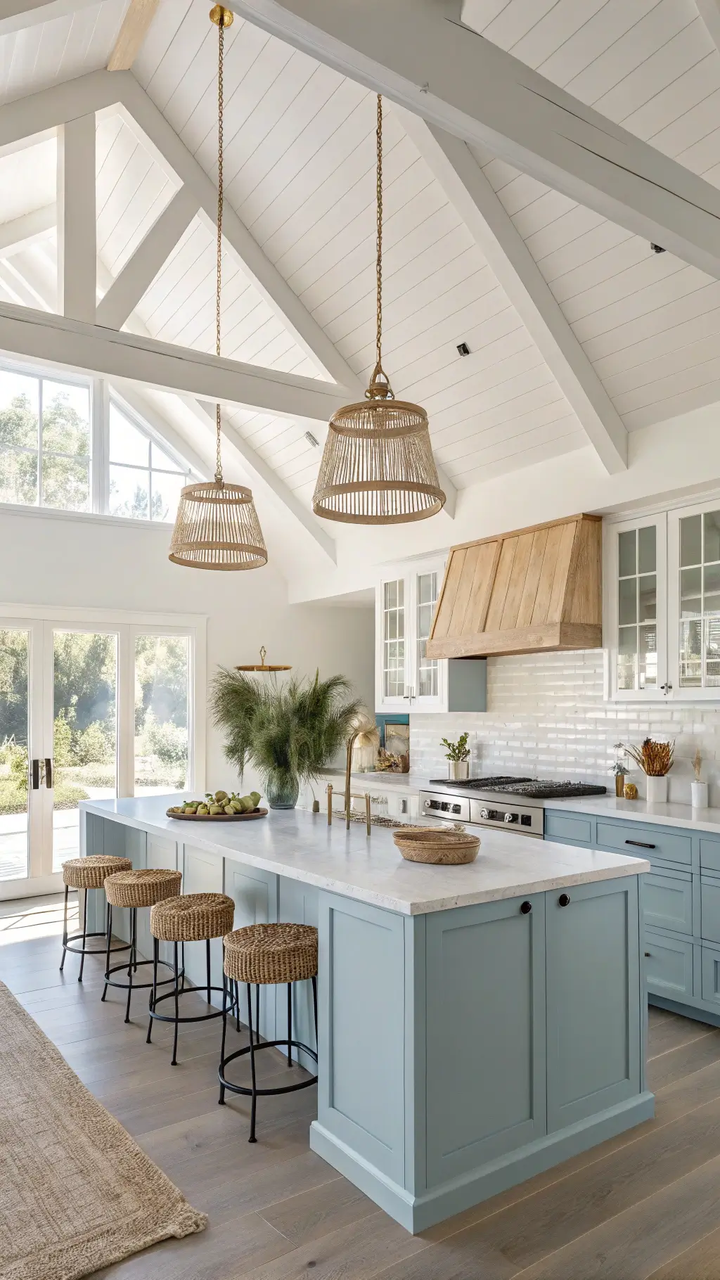
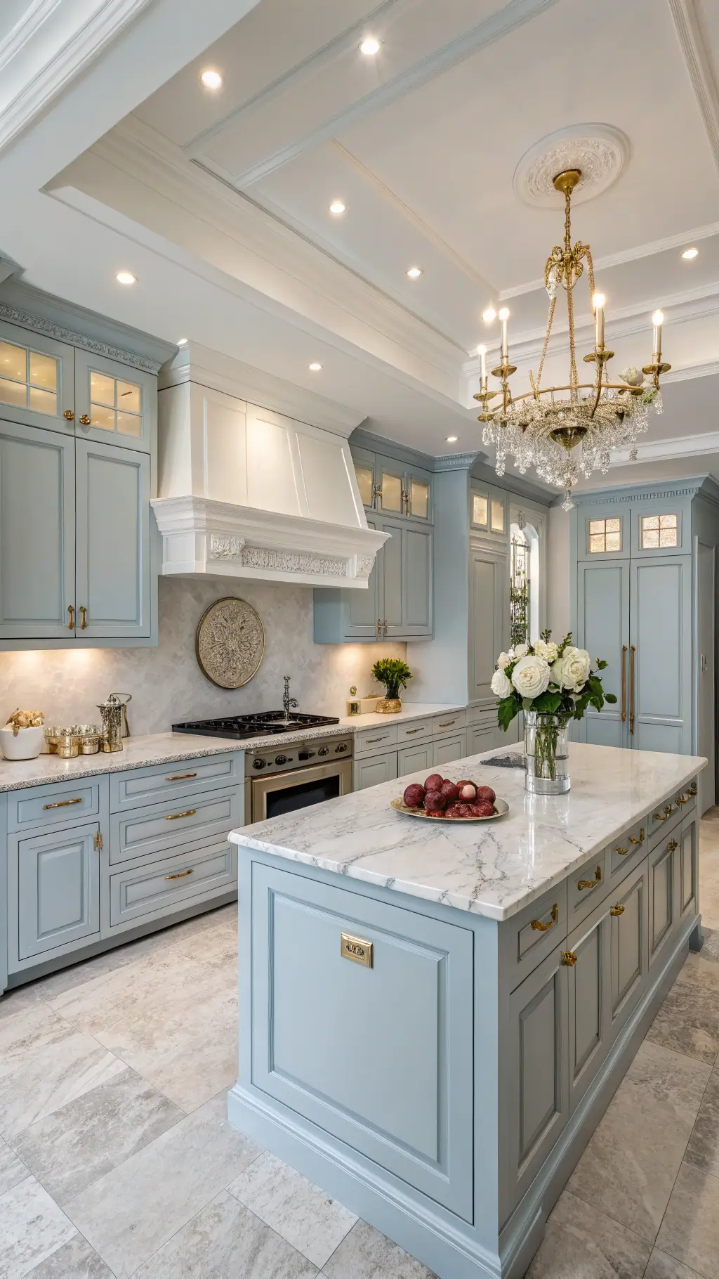
★ Steal This Look
- Paint Color: Sherwin-Williams Powder Blue SW 6523
- Furniture: tapered leg oak dining table with natural finish
- Lighting: brass dome pendant with frosted glass diffuser
- Materials: honed Carrara marble countertops, unlacquered brass hardware, white oak flooring with matte seal
There’s something quietly confident about walking into a kitchen that doesn’t default to white or gray—powder blue invites you to slow down and actually enjoy being in the space.
Psychological Impact of Powder Blue in Kitchens
Colors influence emotions, and powder blue delivers a masterclass in tranquility. It whispers “relaxation” while maintaining professional sophistication.
Design Versatility Breakdown
Styling Options:
- Coastal Retreat Vibes
- Modern Minimalist Approach
- Traditional Elegance with a Twist
- Scandinavian Simplicity
✎ Steal This Look
- Paint Color: Benjamin Moore Palladian Blue HC-144
- Furniture: white oak floating shelves with hidden brackets
- Lighting: aged brass semi-flush mount with milk glass globe
- Materials: honed Carrara marble, unlacquered brass, raw Belgian linen
There’s something almost meditative about starting your morning in a powder blue kitchen—it feels like the room itself is taking a deep breath with you, turning routine coffee rituals into small moments of peace.
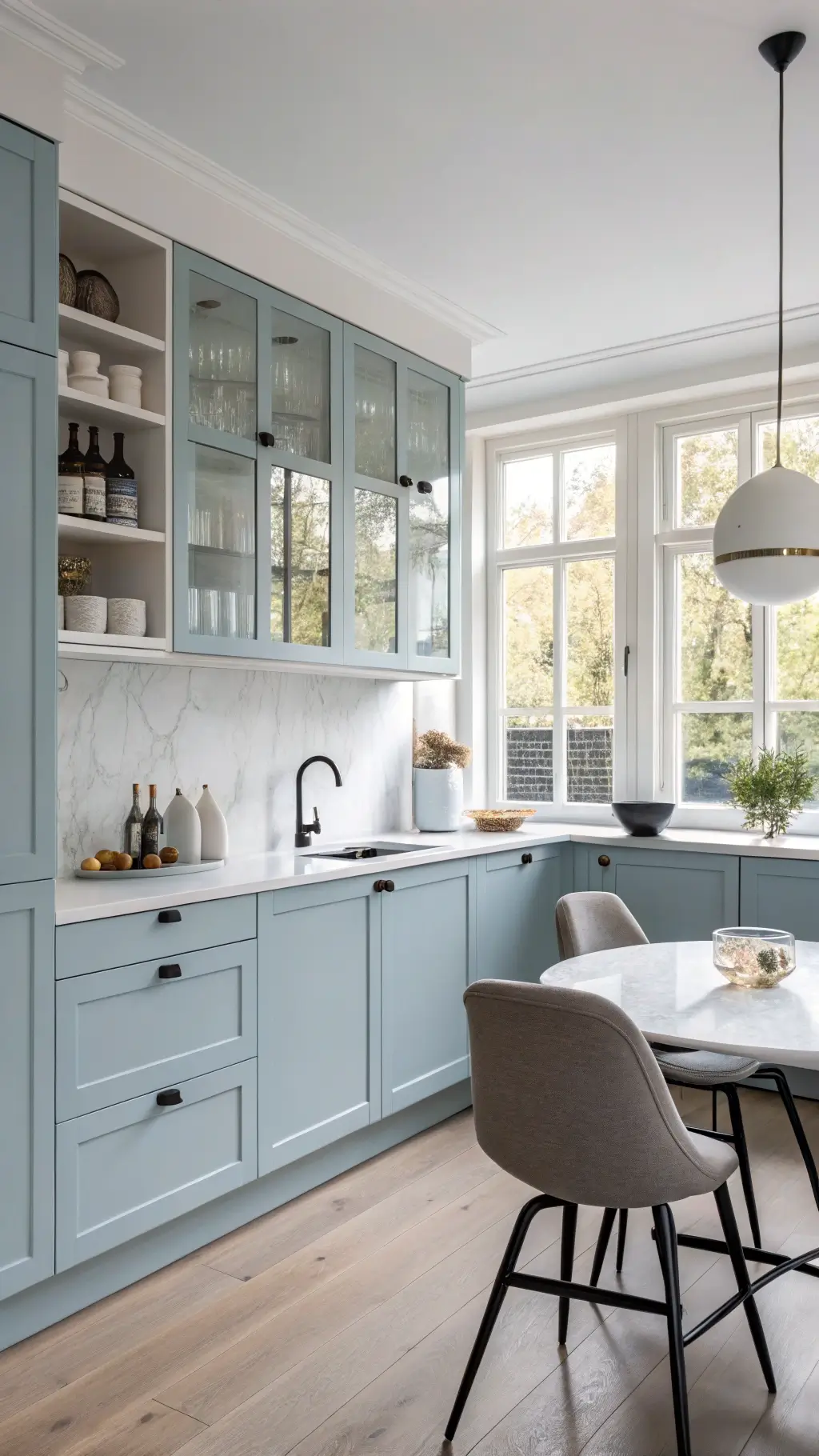
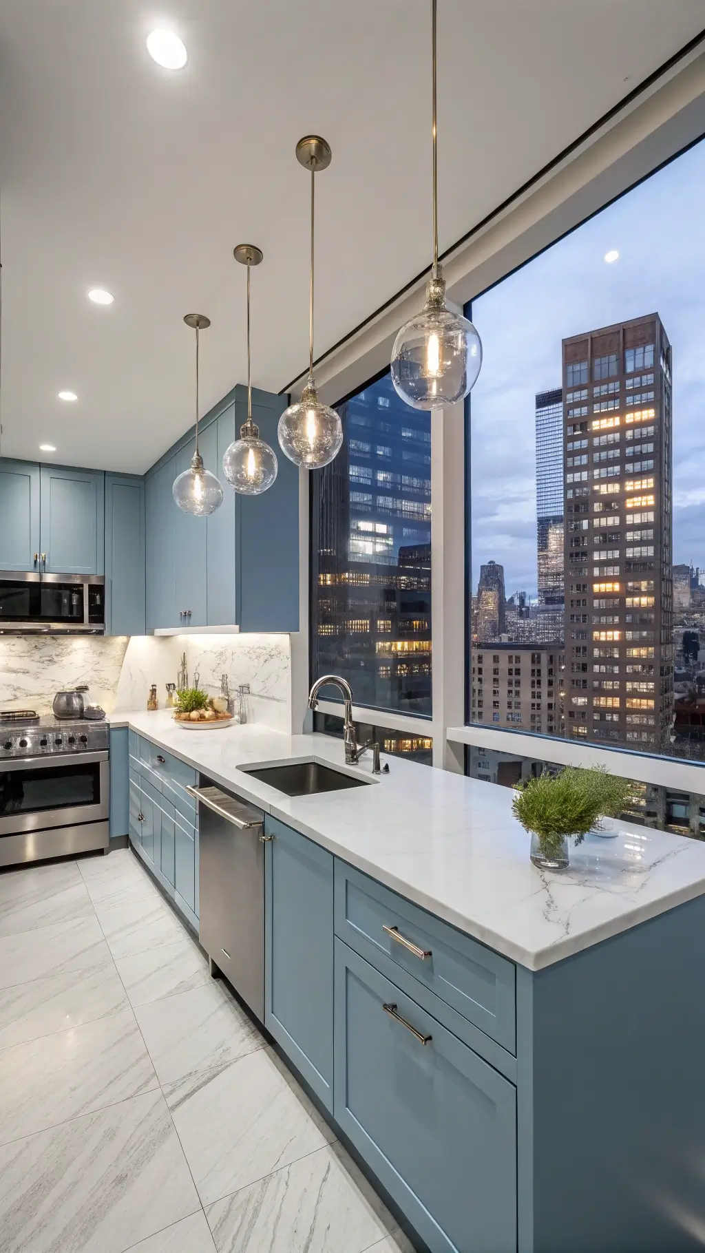
Perfect Pairings: Matching Powder Blue Cabinets
Complementary Elements:
- Countertop Materials:
- Crisp white quartz
- Light grey marble
- Butcher block wood
- Hardware Finishes:
- Brushed nickel
- Matte black
- Champagne bronze
✎ Steal This Look
- Paint Color: Farrow & Ball Parma Gray 27
- Furniture: vintage-inspired brass pot rack mounted above a central island
- Lighting: schoolhouse glass pendant lights with aged brass hardware in a trio over the island
- Materials: honed Carrara marble countertops, unlacquered brass hardware, white oak open shelving with visible grain
There’s something quietly luxurious about a powder blue kitchen—it feels like morning light captured in cabinetry, a color that rewards the homeowner who cooks slowly and lives deliberately.
Practical Considerations

Pro Tip: Lighting matters immensely with powder blue. Natural light enhances the color’s depth and dimension.
Small vs. Large Kitchen Dynamics
- Small Kitchens: Use lighter powder blue shades
- Spacious Kitchens: Experiment with deeper blue tones
🎨 Steal This Look
- Paint Color: Behr Powder Blue PPU15-09
- Furniture: Shaker-style base cabinets with glass-front upper cabinets for display
- Lighting: Schoolhouse pendant lights with white opal glass shades
- Materials: Carrara marble-look quartz countertops, brushed nickel hardware, whitewashed oak flooring
Powder blue kitchens feel like a breath of fresh air during morning coffee rituals, and I’ve noticed homeowners consistently underestimate how much this color shifts throughout the day—embrace that living quality rather than fighting it.
Maintenance and Longevity
Powder blue cabinets require standard kitchen maintenance:
- Use gentle, non-abrasive cleaners
- Avoid harsh chemicals
- Regular dusting
- Touch up paint every 3-5 years
💡 Steal This Look
- Paint Color: use Valspar brand. Match the ACTUAL wall color in the image. Format: Valspar ColorName CODE
- Furniture: specific furniture for this room
- Lighting: specific lighting fixture
- Materials: key textures and materials
Your kitchen works harder than any other room in your home, so treating your powder blue cabinets with a little extra care means you’ll enjoy that serene, coastal-inspired look for decades rather than years.
Cost and Investment

Powder blue cabinets represent a moderate investment:
- Paint: $30-$60 per gallon
- Professional painting: $500-$1500
- Cabinet replacement: $2000-$5000
🏠 Steal This Look
- Paint Color: use PPG brand. Match the ACTUAL wall color in the image. Format: PPG ColorName CODE
- Furniture: specific furniture for this room
- Lighting: specific lighting fixture
- Materials: key textures and materials
Kitchen renovations can feel overwhelming when you’re balancing budget against longevity, but powder blue offers rare flexibility—it pairs equally well with rental-grade updates and forever-home investments.
✓ Get The Look
Making the Decision: Is Powder Blue Right for You?
Ask yourself:
- Do I want a calming kitchen environment?
- Am I comfortable with a slightly bolder color choice?
- Does my space have good lighting?
- Can I commit to occasional maintenance?
🎨 Steal This Look
- Paint Color: Dunn-Edwards Powder Puff DET415
- Furniture: vintage-inspired apron-front sink in crisp white fireclay
- Lighting: schoolhouse pendant lights with brushed nickel hardware
- Materials: matte ceramic subway tile, unlacquered brass pulls, white oak floating shelves
There’s something quietly brave about choosing a color this soft yet specific—it tells guests you actually enjoy being in your kitchen, not just passing through it.
Expert Insights
Top designers agree: powder blue is more than a trend. It’s a strategic design choice that balances emotion and aesthetics.
Quick Pro Recommendations
- Test multiple shades before committing
- Consider room’s natural lighting
- Use sample boards
- Consult a color professional
★ Steal This Look
- Paint Color: Clare Paint Frozen 0025
- Furniture: vintage-inspired oak dining table with turned legs
- Lighting: schoolhouse pendant with aged brass hardware
- Materials: unlacquered brass, honed Carrara marble, raw linen, reclaimed white oak
This is the kitchen where Sunday morning coffee tastes better—powder blue has that rare ability to feel both fresh and familiar, like a room you’ve loved for years even if you just finished the renovation.
Final Thoughts
Powder blue kitchen cabinets aren’t just a color choice – they’re a lifestyle statement. They transform cooking spaces from mere functional areas into serene sanctuaries.
Remember: Great design tells a story. What story will your powder blue kitchen tell?